Lesson 9
Feature Support & Polyfills
Building a website can be both extremely rewarding and frustrating. Common frustrations arise from trying to get a website to look and perform the same in every browser. All front end developers have shared this frustration at one point or another.
Truth be told, websites do not need to look or perform the same in every browser. Exactly how close a website works in each browser is up to you and your level of comfort for a given website. If a website receives under half a percent of traffic from Internet Explorer 6 it might make sense to drop support for it. If that half a percent is still contributing to thousands of dollars in sales, support may be mandatory. Determine what is acceptable for a given website and work from there.
There are a handful of common practices to get websites to perform adequately in all browsers, some of which have already been covered within this guide. When incorporating CSS3 properties, fallbacks are recommend to support older browsers. Other techniques include shivs and polyfills. Generally speaking, shivs and polyfills are small JavaScript plugins that add support for a requested set of features not natively supported by a specific browser.
HTML5 Shiv
Perhaps the most popular shiv, and one you may have likely used already, is the HTML5 Shiv. The HTML5 Shiv was created by Remy Sharp to provide the ability to use HTML5 elements within versions of Internet Explorer 8 and below. The HTML5 Shiv not only creates support for HTML5 elements but also allows them to be properly styled with CSS.
The shiv should be downloaded from Google, where Remy maintains the latest version, then hosted on your server. For the best performance, reference the shiv JavaScript file within the head of the document, after any stylesheet references. Additionally, you want to reference the shiv inside of a conditional comment, making sure that the file is only loaded within versions of Internet Explorer 8 and below.
In this case the conditional comment looks like <!--[if lt IE 9]>...<![endif]-->.
1
2
3
4
<!--[if lt IE 9]>
<script src="html5shiv.js"></script>
<![endif]-->
The Difference Between a Shiv & a Shim
Chances are you may have heard of both the HTML5 Shiv and HTML5 Shim, and wondered what the difference, if any, may be. Oddly enough, there is no difference between the HTML5 Shiv and HTML5 Shim. The two words are often used interchangeably and are commonly transposed.
Additionally, once the new HTML5 elements are created using the shiv, any block level elements need to be identified and updated using the display: block; declaration.
1
2
3
4
5
6
7
8
9
10
11
12
13
14
article,
aside,
details,
figcaption,
figure,
footer,
header,
hgroup,
nav,
section,
summary {
display: block;
}
Lastly, Internet Explorer 8 and 9 do not correctly define styles for a few HTML5 inline-block level elements. As before, these styles will need to be explicitly stated. After which, all versions of Internet Explorer should be good to go using any new HTML5 elements.
1
2
3
4
5
6
audio,
canvas,
video {
display: inline-block;
}
Detecting Browser Features
Referencing the HTML5 Shiv works well with a conditional comment because the intention is to specifically target browsers that don’t support new HTML5 features and elements. Additionally, there is a way to to provide support for specific HTML5 and CSS3 features, regardless of which browser is being used.
Feature detection, as provided by Modernizr, provides a way to write conditional CSS and JavaScript based on whether or not a browser supports a specific feature. For example, if a browser supports rounded corners Modernizr will add the class of borderradius to the html element. If the browser doesn’t support rounded corners, Modernizr will add the class of no-borderradius to the html element.
Loading Modernizr
To get feature detection with Modernizr up and running, visit their download page and customize what features you are looking to detect. Once downloaded, upload the JavaScript file on your server and reference it within the head of your HTML document, below any referenced style sheets.
It is worth noting that Modernizr may be configured to include the HTML5 Shiv, in which case the shiv doesn’t need to be referenced on top of Modernizr.
1
2
<script src="modernizr.js"></script>
Conditionally Applying CSS Styles
Once Modernizr is up and running CSS styles may be conditionally applied based on the features a given browser supports. Modernizr has detection for the majority of the CSS3 properties and values, all of which can be found in the Modernizr documentation.
One item to weigh out is if feature detection is necessary for certain styles. For example, using an RGBa color value may easily be supported with a fallback hexadecimal value without the use of feature detection. When deciding to use feature detection, it is important to keep styles organized and performance in mind. Avoid duplicating any code or making additional HTTP requests when possible.
1
2
3
4
5
6
7
8
9
10
11
12
13
14
15
16
17
18
19
20
21
22
23
24
25
26
27
28
29
30
31
32
33
34
35
36
37
38
button {
border: 0;
color: #fff;
cursor: pointer;
font-size: 14px;
font-weight: 600;
margin: 0;
outline: 0;
}
/* With CSS Gradient Styles */
.cssgradients button {
border: 1px solid #0080c2;
background: linear-gradient(#00a2f5, #0087cc);
border-radius: 6px;
padding: 15px 30px;
}
.cssgradients button:hover {
background: linear-gradient(#1ab1ff, #009beb);
}
.cssgradients button:active {
box-shadow: inset 0 1px 10px rgba(255, 255, 255, .5);
}
/* Without CSS Gradient Styles */
.no-cssgradients button {
background: transparent url("button.png") 0 0 no-repeat;
padding: 16px 31px;
}
.no-cssgradients button:hover {
background-position: 0 -49px;
}
.no-cssgradients button:active {
background-position: 0 -98px;
}
Feature Detection Demo
See the Pen Feature Detection by Shay Howe (@shayhowe) on CodePen.
In the demonstration above, the button inherits some default styles. However, specific styles are only applied based on whether or not CSS3 gradient background are supported. In this case, rounded corners and box shadows are also included within the conditional styles. Those browsers that support gradients get a gradient background, rounded corners, and a box shadow. Those browsers that do not receive an image with all of these styles included within the image. With this code none of the styles are being over written and an HTTP request is only made when necessary.
When working with CSS3 feature detection it is hard to know what the styles look like in browsers that do not support specific CSS3 features. Fortunately, there is a bookmarklet called deCSS3 which disables any CSS3 features. Doing so allows you to see what a website would look like without CSS3, and if your conditional styles are working.
Conditionally Loading Files
On top of conditionally loading styles, Modernizr also provides a way to use feature detection in JavaScript. With this, JavaScript polyfills and conditional files may be loaded based on the detection of a given feature with the help of jQuery and the jQuery getScript method.
Using Modernizr to set the condition of an if statement in Javascript allows different scripts to be executed based on whether or not the given condition is true or false. Below Modernizr is checking for local storage support. If local storage is supported jQuery is used to load the storage.js file using the getScript method, and if local storage is not supported jQuery is used the storage-polyfill.js file using the getScript method.
1
2
3
4
5
6
7
8
9
10
$(document).ready(function() {
if (Modernizr.localstorage) {
// Local storage is available
jQuery.getScript('storage.js');
} else {
// Local storage is not available
jQuery.getScript('storage-polyfill.js');
}
});
Conditionally Loading Based on Media Queries
One interesting condition Modernizr can test against is media queries. Doing so provides the ability to only load files based on different media query conditions. Not loading unnecessary files can be extremely beneficial for performance.
1
2
3
4
5
6
$(document).ready(function() {
if (Modernizr.mq('screen and (min-width: 640px)')) {
jQuery.getScript('tabs.js');
}
});
Above, Modernizr looks to detect screens above 640 pixels wide, primarily desktops, and then loads the tabs.js file based off of this condition. It is important to note that this condition is tested only once, when the page loads, and that is it. Should a user resize the page, this condition will not be retested. Should this condition need to be retested, additional JavaScript would need to be included.
Conditionally Running Scripts
Using Modernizr, all of the HTML5 and CSS3 features they detect may be tested within JavaScript. For example, it may be worth disabling tooltips on mobile devices due to not having hover capabilities, and instead showing the tooltip in plain text on the screen. The script for calling these tooltips could be wrapped in a Modernizr condition, preventing the script from loading on smaller screens.
1
2
3
4
5
6
$(document).ready(function() {
if (Modernizr.mq('screen and (max-width: 400px)')) {
$('.size').text('small');
}
});
Conditionally Running Scripts Demo
See the Pen Conditionally Running Scripts by Shay Howe (@shayhowe) on CodePen.
Above is a basic example of how JavaScript can be executed based on a condition established by Modernizr. Upon loading the page, if the screen is above 800 pixels wide nothing happens. However, if the screen is below 800 pixels wide, upon being loaded, the word ‘small’ will be swapped for ‘large’ based off of the executed JavaScript.
HTML5 & CSS3 Polyfills
Currently there are polyfills for nearly all of the different HTML5 and CSS3 features. The team over at Modernizr has put together quite an exhaustive list of polyfills. These polyfills can be dropped in as needed.
The same people behind Modernizr have also put together a list of all of the new HTML5 and CSS3 features, including instructions on how to use them responsibly. Understand, not all of these features need polyfills. Quite a few of them can be used outright or with the use of a fallback.
Cross Browser Testing
Perhaps the most dreaded part of web design and development is cross browser testing, making sure a website works well in all browsers. Generally speaking the more modern browsers, Chrome, Firefox, and Safari, all perform pretty well. The largest pitfalls live within Internet Explorer, and testing different versions of Internet Explorer can be difficult.
There are a handful of services out there that do help with cross browser testing, some are interactive while others are not. Being able to interact with a browser, rather than seeing a rendered screenshot, is far more helpful for debugging code. One of the best ways to boot up multiple versions of Internet Explorer is by using multiple virtual machines, each with a different version of Internet Explorer.
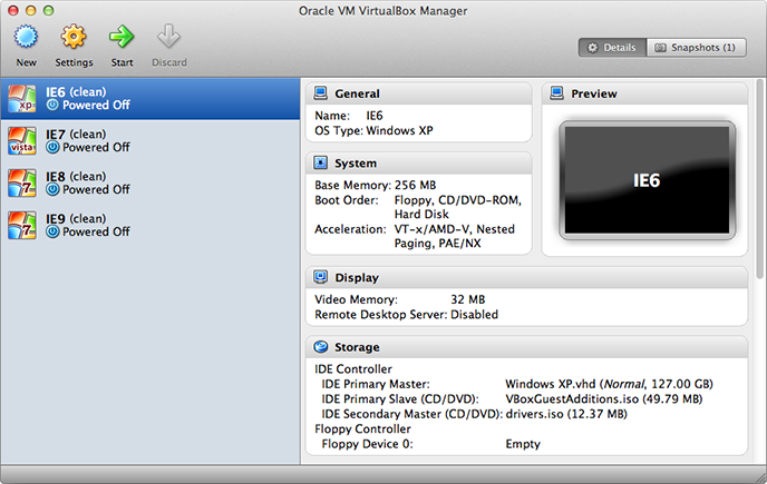
VirtualBox running on Mac OS X with Internet Explorer versions 6 through 9.
Microsoft provides a handful of VirtualPCs that can be used solely for testing. Setting all of these up can be a herculean task. Fortunately, Greg Thornton has built an automated installer for all of these virtual machines. The installation takes a while to download all of the different virtual machines, and requires a decent amount of disk space. Prepare adequately by only installing the necessary virtual machines and by clearing up the necessary disk space ahead of time. Depending on how often the virtual machines are used, it may be worth installing them on an external hard drive.
Internet Explorer versions 8 and above have built-in development tools, unfortunately versions 7 and below do not. The web inspector and all of the other debugging tools we’ve grown to love are not readily available within Internet Explorer 7 and below.
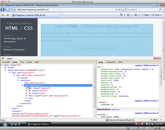
Internet Explorer 7 running inside of a virtual machine with the Firebug Lite bookmarklet open for debugging.
Resources & Links
- HTML5 Shiv via Remy Sharp
- How To Create an IE-Only Stylesheet via CSS-Tricks
- Modernizr
- Loading Scripts with jQuery via David Walsh
- deCSS3 via Dave Rupert
- HTML5 Cross Browser Polyfills
- HTML5 Please
- Microsoft IE Virtual Machines via Greg Thornton