Lesson 4
Responsive Web Design
The Internet took off quicker than anyone would have predicted, growing like crazy. Now, for the past few years, mobile growth has exploded onto the scene. The growth of mobile Internet usage is also far out pacing that of general Internet usage growth.
These days it is hard to find someone who doesn’t own a mobile device, or multiple, connected to the Internet. In the UK there are more mobile phones than people, and should trends continue mobile Internet usage will surpass that of desktop Internet usage within the year.
With the growth in mobile Internet usage comes the question of how to build websites suitable for all users. The industry response to this question has become responsive web design, also known as RWD.
Responsive Overview
Responsive web design is the practice of building a website suitable to work on every device and every screen size, no matter how large or small, mobile or desktop. Responsive web design is focused around providing an intuitive and gratifying experience for everyone. Desktop computer and cell phone users alike all benefit from responsive websites.
The responsive web design term itself was coined, and largely developed, by Ethan Marcotte. A lot of what is covered in this lesson was first talked about by Ethan online and in his book Responsive Web Design, which is worth a read.
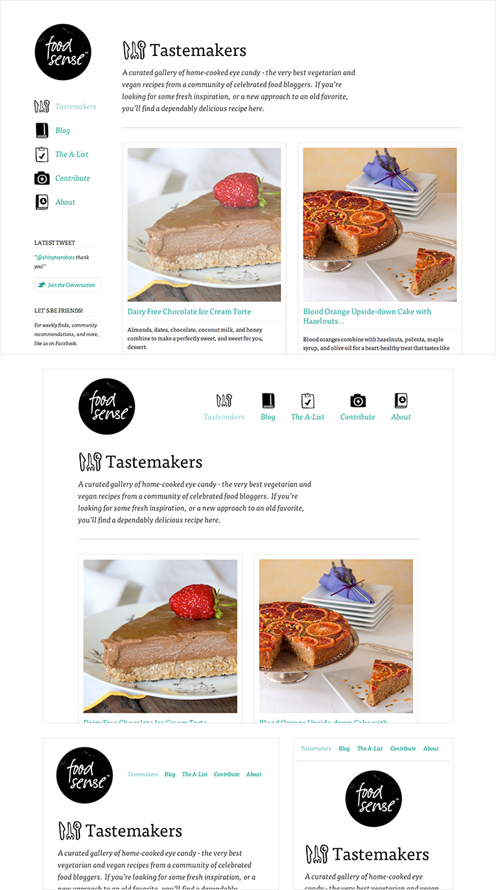
Food Sense has a beautiful website, responsive to all different viewport sizes. No matter how large or small the viewport may be the Food Sense website adjust, creating a natural user experience.
Responsive vs. Adaptive vs. Mobile
For some the term responsive may not be new, and others might be even more acquainted with the terms adaptive or mobile. Which may leave you wondering what exactly is the difference between all of them.
Responsive and adaptive web design are closely related, and often transposed as one in the same. Responsive generally means to react quickly and positively to any change, while adaptive means to be easily modified for a new purpose or situation, such as change. With responsive design websites continually and fluidly change based on different factors, such as viewport width, while adaptive websites are built to a group of preset factors. A combination of the two is ideal, providing the perfect formula for functional websites. Which term is used specifically doesn’t make a huge difference.
Mobile, on the other hand, generally means to build a separate website commonly on a new domain solely for mobile users. While this does occasionally have its place, it normally isn’t a great idea. Mobile websites can be extremely light but they do come with the dependencies of a new code base and browser sniffing, all of which can become an obstacle for both developers and users.
Currently the most popular technique lies within responsive web design, favoring design that dynamically adapts to different browser and device viewports, changing layout and content along the way. This solution has the benefits of being all three, responsive, adaptive, and mobile.
Flexible Layouts
Responsive web design is broken down into three main components, including flexible layouts, media queries, and flexible media. The first part, flexible layouts, is the practice of building the layout of a website with a flexible grid, capable of dynamically resizing to any width. Flexible grids are built using relative length units, most commonly percentages or em units. These relative lengths are then used to declare common grid property values such as width, margin, or padding.
Relative Viewport Lengths
CSS3 introduced some new relative length units, specifically related to the viewport size of the browser or device. These new units include vw, vh, vmin, and vmax. Overall support for these new units isn’t great, but it is growing. In time they look to play a large roll in building responsive websites.
-
vw
Viewports width -
vh
Viewports height -
vmin
Minimum of the viewport’s height and width -
vmax
Maximum of the viewport’s height and width
Flexible layouts do not advocate the use of fixed measurement units, such as pixels or inches. Reason being, the viewport height and width continually change from device to device. Website layouts need to adapt to this change and fixed values have too many constraints. Fortunately, Ethan pointed out an easy formula to help identify the proportions of a flexible layout using relative values.
The formula is based around taking the target width of an element and dividing it by the width of it’s parent element. The result is the relative width of the target element.
1
2
target ÷ context = result
Flexible Grid
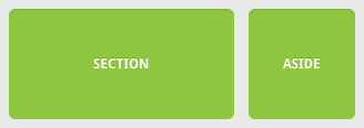
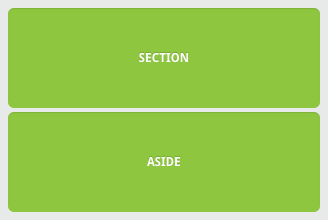
Let’s see how this formula works inside of a two column layout. Below we have a parent division with the class of container wrapping both the section and aside elements. The goal is to have the section on the left and the aside on the right, with equal margins between the two. Normally the markup and styles for this layout would look a bit like the following.
HTML
1
2
3
4
5
<div class="container">
<section>...</section>
<aside>...</aside>
</div>
CSS
1
2
3
4
5
6
7
8
9
10
11
12
13
14
15
16
.container {
width: 538px;
}
section,
aside {
margin: 10px;
}
section {
float: left;
width: 340px;
}
aside {
float: right;
width: 158px;
}
Fixed Grid Demo
See the Pen Fixed Grid by Shay Howe (@shayhowe) on CodePen.
Using the flexible grid formula we can take all of the fixed units of length and turn them into relative units. In this example we’ll use percentages but em units would work equally as well. Notice, no matter how wide the parent container becomes, the section and aside margins and widths scale proportionally.
1
2
3
4
5
6
7
8
9
10
11
12
13
section,
aside {
margin: 1.858736059%; /* 10px ÷ 538px = .018587361 */
}
section {
float: left;
width: 63.197026%; /* 340px ÷ 538px = .63197026 */
}
aside {
float: right;
width: 29.3680297%; /* 158px ÷ 538px = .293680297 */
}
Flexible Grid Demo
See the Pen Flexible Grid by Shay Howe (@shayhowe) on CodePen.
Taking the flexible layout concept, and formula, and reapplying it to all parts of a grid will create a completely dynamic website, scaling to every viewport size. For even more control within a flexible layout, you can also leverage the min-width, max-width, min-height, and max-height properties.
The flexible layout approach alone isn’t enough. At times the width of a browser viewport may be so small that even scaling the the layout proportionally will create columns that are too small to effectively display content. Specifically, when the layout gets too small, or too large, text may become illegible and the layout may begin to break. In this event, media queries can be used to help build a better experience.
Media Queries
Media queries were built as an extension to media types commonly found when targeting and including styles. Media queries provide the ability to specify different styles for individual browser and device circumstances, the width of the viewport or device orientation for example. Being able to apply uniquely targeted styles opens up a world of opportunity and leverage to responsive web design.
Initializing Media Queries
There are a couple different ways to use media queries, using the @media rule inside of an existing style sheet, importing a new style sheet using the @import rule, or by linking to a separate style sheet from within the HTML document. Generally speaking it is recommend to use the @media rule inside of an existing style sheet to avoid any additional HTTP requests.
HTML
1
2
3
<!-- Separate CSS File -->
<link href="styles.css" rel="stylesheet" media="all and (max-width: 1024px)">
CSS
1
2
3
4
5
6
/* @media Rule */
@media all and (max-width: 1024px) {...}
/* @import Rule */
@import url(styles.css) all and (max-width: 1024px) {...}
Each media query may include a media type followed by one or more expressions. Common media types include all, screen, print, tv, and braille. The HTML5 specification includes new media types, even including 3d-glasses. Should a media type not be specified the media query will default the media type to screen.
The media query expression that follows the media type may include different media features and values, which then allocate to be true or false. When a media feature and value allocate to true, the styles are applied. If the media feature and value allocate to false the styles are ignored.
Logical Operators in Media Queries
Logical operators in media queries help build powerful expressions. There are three different logical operators available for use within media queries, including and, not, and only.
Using the and logical operator within a media query allows an extra condition to be added, making sure that a browser or devices does both a, b, c, and so forth. Multiple individual media queries can be comma separated, acting as an unspoken or operator. The example below selects all media types between 800 and 1024 pixels wide.
1
2
@media all and (min-width: 800px) and (max-width: 1024px) {...}
The not logical operator negates the query, specifying any query but the one identified. In the example below the expression applies to any device that does not have a color screen. Black and white or monochrome screens would apply here for example.
1
2
@media not screen and (color) {...}
The only logical operator is a new operator and is not recognized by user agents using the HTML4 algorithm, thus hiding the styles from devices or browsers that don’t support media queries. Below, the expression selects only screens in a portrait orientation that have a user agent capable of rending media queries.
1
2
@media only screen and (orientation: portrait) {...}
Omitting a Media Type
When using the not and only logical operators the media type may be left off. In this case the media type is defaulted to all.
Media Features in Media Queries
Knowing the media query syntax and how logical operators work is a great introduction to media queries but the true work comes with media features. Media features identify what attributes or properties will be targeted within the media query expression.
Height & Width Media Features
One of the most common media features revolves around determining a height or width for a device or browser viewport. The height and width may be found by using the height and width media features. Each of these media features may then also be prefixed with the min or max qualifiers, building a feature such as min-width or max-width.
The height and width features are based off the height and width of the viewport rendering area, the browser window for example. Values for these height and width media features may be any length unit, relative or absolute.
1
2
@media all and (min-width: 320px) and (max-width: 780px) {...}
Within responsive design the most commonly used features include min-width and max-width. These help build responsive websites on desktops and mobile devices equally, avoiding any confusion with device features.
Using Minimum & Maximum Prefixes
The min and max prefixes can be used on quite a few media features. The min prefix indicates a values of greater than or equal to while the max prefix indicates a value of less than or equal to. Using min and max prefixes avoid any conflict with the general HTML syntax, specifically not using the < and > symbols.
Orientation Media Feature
The orientation media feature determines if a device is in the landscape or portrait orientation. The landscape mode is triggered when the display is wider than taller, and the portrait mode is triggered when the display is taller than wider. This media feature plays a large part with mobile devices.
1
2
@media all and (orientation: landscape) {...}
Aspect Ratio Media Features
The aspect-ratio and device-aspect-ratio features specifies the width/height pixel ratio of the targeted rendering area or output device. The min and max prefixes are available to use with the different aspect ratio features, identifying a ratio above or below that of which is stated.
The value for the aspect ratio feature consist of two positive integers separated by a forward slash. The first integer identifies the width in pixels while the second integer identifies the height in pixels.
1
2
@media all and (min-device-aspect-ratio: 16/9) {...}
Pixel Ratio Media Features
In addition to the aspect ratio media features there are also pixel-ratio media features. These features do include the device-pixel-ratio feature as well as min and max prefixes. Specifically, the pixel ratio feature is great for identifying high definition devices, including retina displays. Media queries for doing so look like the following.
1
2
@media only screen and (-webkit-min-device-pixel-ratio: 1.3), only screen and (min-device-pixel-ratio: 1.3) {...}
Resolution Media Feature
The resolution media feature specifies the resolution of the output device in pixel density, also known as dots per inch or DPI. The resolution media feature does accept the min and max prefixes. Additionally, the resolution media feature will accept dots per pixel (1.3dppx), dots per centimeter (118dpcm), and other length based resolution values.
1
2
@media print and (min-resolution: 300dpi) {...}
Other Media Features
Other media features include identifying available output colors with use of the color, color-index, and monochrome features, identifying bitmap devices with the grid feature, and identifying the scanning process of a television with the scan feature. These features are less common but equally as helpful when needed.
Media Query Browser Support
Unfortunately media queries do not work within Internet Explorer 8 and below, as well as other legacy browsers. There are, however, a couple suitable polyfills written in Javascript.
Respond.js is a lightweight polyfill that only looks for min/max-width media types, which is perfect should those be the only media query types used. CSS3-MediaQueries.js is a more developed, and heavier, polyfill offering support for a larger array of more complex media queries. Additionally, keep in mind any polyfill can have performance concerns, and potentially slow down websites. Make sure that any given polyfill is worth the performance trade off.
Media Queries Demo
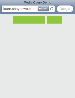
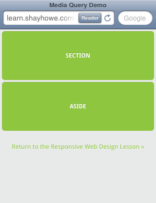
Using media queries we will now rewrite the flexible layout we built previously. One of the current problems within the demo appears when the aside width becomes uselessly small within smaller viewports. Adding a media query for viewports under 420 pixels wide we can change the layout by turning off the floats and changing the widths of the section and aside.
1
2
3
4
5
6
7
@media all and (max-width: 420px) {
section, aside {
float: none;
width: auto;
}
}
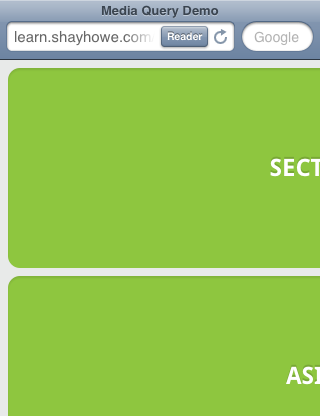
Without any media queries the section and aside become quite small. Perhaps too small to even contain any real content.
Using media queries to remove the floats and change their widths, the section and aside are now able to span the full width of the viewport, allowing breathing room for any existing content.
Identifying Breakpoints
Your instinct might be to write media query breakpoints around common viewport sizes as determined by different device resolutions, such as 320px, 480px, 768px, 1024px, 1224px, and so forth. This is a bad idea.
When building a responsive website it should adjust to an array of different viewport sizes, regardless of the device. Breakpoints should only be introduced when a website starts to break, look weird, or the experience is being hampered.
Additionally, new devices and resolutions are being released all of the time. Trying to keep up with these changes could be an endless process.
Mobile First
One popular technique with using media queries is called mobile first. The mobile first approach includes using styles targeted at smaller viewports as the default styles for a website, then use media queries to add styles as the viewport grows.
The operating belief behind mobile first design is that a user on a mobile device, commonly using a smaller viewport, shouldn’t have to load the styles for a desktop computer only to have them over written with mobile styles later. Doing so is a waste of bandwidth. Bandwidth that is precious to any users looking for a snappy website.
The mobile first approach also advocates designing with the constraints of a mobile user in mind. Before too long, the majority of Internet consumption will be done on a mobile device. Plan for them accordingly and develop intrinsic mobile experiences.
A breakout of mobile first media queries might look at bit like the following.
1
2
3
4
5
6
/* Default styles first then media queries */
@media screen and (min-width: 400px) {...}
@media screen and (min-width: 600px) {...}
@media screen and (min-width: 1000px) {...}
@media screen and (min-width: 1400px) {...}
Additionally, downloading unnecessary media assets can be stopped by using media queries. Generally speaking, avoiding CSS3 shadows, gradients, transforms, and animations within mobile styles isn’t a bad idea either. When used excessively, they cause heavy loading and can even reduce a device’s battery life.
1
2
3
4
5
6
7
8
9
10
11
/* Default media */
body {
background: #ddd;
}
/* Media for larger devices */
@media screen and (min-width: 800px) {
body {
background-image: url("bg.png") 50% 50% no-repeat;
}
}
Mobile First Demo
Adding media queries to our previous example, we overwrote a handful of styles in order to have a better layout on viewports under 420 pixels wide. Rewriting this code to use the mobile styles first by default then adding media queries to adjust for viewports over 420 pixels wide we build the following:
1
2
3
4
5
6
7
8
9
10
11
12
13
14
15
16
17
18
section,
aside {
margin: 1.858736059%;
}
@media all and (min-width: 420px) {
.container {
max-width: 538px;
}
section {
float: left;
width: 63.197026%;
}
aside {
float: right;
width: 29.3680297%;
}
}
Mobile First Demo
See the Pen Mobile First by Shay Howe (@shayhowe) on CodePen.
Notice, this is the same amount of code as before. The only exception here is that mobile devices only have to render only one CSS declaration. All of the other styles are deferred, only loading on larger viewports and done so without overwriting any initial styles.
Viewport
Mobile devices generally do a pretty decent job of displaying websites these days. Sometimes they could use a little assistance though, particularly around identifying the viewport size, scale, and resolution of a website. To remedy this, Apple invented the viewport meta tag.
Although this demo has media queries, many mobile devices still do not know the initial width or scale of the website. Therefore, they may not interrupt media queries.
Viewport Height & Width
Using the viewport meta tag with either the height or width values will define the height or width of the viewport respectively. Each value accepts either a positive integer or keyword. For the height property the keyword device-height value is accepted, and for the width property the keyword device-width is accepted. Using these keywords will inherit the device’s default height and width value.
For the best results, and the best looking website, it is recommend that you use the device defaults by applying the device-height and device-width values.
1
2
<meta name="viewport" content="width=device-width">
Letting devices know the intended width of the website, device-width in this case, allows the website to be sized properly and to pick up any qualifying media queries.
Viewport Scale
To control how a website is scaled on a mobile device, and how users can continue to scale a website, use the minimum-scale, maximum-scale, initial-scale, and user-scalable properties.
The initial-scale of a website should be set to 1 as this defines the ratio between the device height, while in a portrait orientation, and the viewport size. Should a device be in landscape mode this would be the ratio between the device width and the viewport size. Values for initial-scale should always be a positive integer between 0 and 10.
1
2
<meta name="viewport" content="initial-scale=2">
Using an integer above 1 will zoom the website to be larger than the default scale. Generally speaking, this value will most commonly be set to 1.
The minimum-scale and maximum-scale values determine how small and how large a viewport may be scaled. When using minimum-scale the value should be a positive integer lower than or equal to the initial-scale. Using the same reasoning, the maximum-scale value should be a positive integer greater than or equal to the initial-scale. Values for both of these must also be between 0 and 10.
1
2
<meta name="viewport" content="minimum-scale=0">
Generally speaking, these values should not be set to the same value as the initial-scale. This would disable any zooming, which can be accomplished instead by using the user-scalable value. Setting the user-scalable value to no will disable any zooming. Alternatively, setting the user-scalable value to yes will turn on zooming.
Turning off the ability to scale a website is a bad idea. It harms accessibility and usability, preventing those with disabilities from viewing a website as desired.
1
2
<meta name="viewport" content="user-scalable=yes">
Viewport Resolution
Letting the browser decide how to scale a website based off any viewport scale values usually does the trick. When more control is needed, specifically over the resolution of a device, the target-densitydpi value may be used. The target-densitydpi viewport accepts a handful of values including device-dpi, high-dpi, medium-dpi, low-dpi, or an actual DPI number.
Using the target-densitydpi viewport value is rare, but extremely helpful when pixel by pixel control is needed.
1
2
<meta name="viewport" content="target-densitydpi=device-dpi">
Combining Viewport Values
The viewport meta tag will accept individual values as well as multiple values, allowing multiple viewport properties to be set at once. Setting multiple values requires comma separating them within the content attribute value. One of the recommended viewport values is outlined below, using both the width and initial-scale properties.
1
2
<meta name="viewport" content="width=device-width, initial-scale=1">
A combination of width=device-width and initial-scale=1 provide the initial size and zoom commonly required.
CSS Viewport Rule
Since the viewport meta tag revolves so heavily around setting the styles of how a website should be rendered it has been recommend to move the viewport from a meta tag with HTML to an @ rule within CSS. This helps keep the style separated from content, providing a more semantic approach.
Currently some browsers have already implemented the @viewport rule, however support isn’t great across the board. The previously recommended viewport meta tag would look like the following @viewport rule in CSS.
1
2
3
4
5
@viewport {
width: device-width;
zoom: 1;
}
Flexible Media
The final, equally important aspect to responsive web design involves flexible media. As viewports begin to change size media doesn’t always follow suit. Images, videos, and other media types need to be scalable, changing their size as the size of the viewport changes.
One quick way to make media scalable is by using the max-width property with a value of 100%. Doing so ensures that as the viewport gets smaller any media will scale down according to its containers width.
1
2
3
4
img, video, canvas {
max-width: 100%;
}
Flexible Media Demo
See the Pen Flexible Media by Shay Howe (@shayhowe) on CodePen.
Flexible Embedded Media
Unfortunately the max-width property doesn’t work well for all instances of media, specifically around iframes and embedded media. When it comes to third party websites, such as YouTube, who use iframes for embedded media this is a huge disappointment. Fortunately, there is a work around.
To get embedded media to be fully responsive, the embedded element needs to be absolutely positioned within a parent element. The parent element needs to have a width of 100% so that it may scale based on the width of the viewport. The parent element also needs to have a height of 0 to trigger the hasLayout mechanism within Internet Explorer.
Padding is then given to the bottom of the parent element, the value of which is set in the same aspect ratio of the video. This allows the height of the parent element to be proportionate to that of it’s width. Remember the responsive design formula from before? If a video has an aspect ratio of 16:9, 9 divided by 16 equals .5625, thus requiring a bottom padding of 56.25%. Padding on the bottom and not the top is specifically used to prevent Internet Explorer 5.5 from breaking, and treating the parent element as an absolutely positioned element.
HTML
1
2
3
4
<figure>
<iframe src="https://www.youtube.com/embed/Sv3xVOs7_No"></iframe>
</figure>
CSS
1
2
3
4
5
6
7
8
9
10
11
12
13
14
figure {
height: 0;
padding-bottom: 56.25%; /* 16:9 */
position: relative;
width: 100%;
}
iframe {
height: 100%;
left: 0;
position: absolute;
top: 0;
width: 100%;
}
Flexible Embedded Media Demo
For security reasons CodePen doesn’t allow iframes within embedded code samples, however you may review and edit this code on their website.
100% Wide Container
75% Wide Container
50% Wide Container
Resources & Links
- Responsive Web Design via A List Apart
- Viewport Percentage Lengths via W3C
- CSS Media Queries via CSS-Tricks
- Mobile First via Luke Wroblewski
- An Introduction to Meta Viewport and @viewport via Dev.Opera