Lesson 10
Extending Semantics & Accessibility
Semantics and accessibility are naturally part of HTML by design, however they are not fully leveraged unless used accordingly. Knowing how to write semantic and accessible code properly takes an understanding of how semantics and accessibility work, and how users and machines interpret them. Writing semantic and accessible code isn’t incredibly difficult, but it can be time consuming. In the long run, however, the benefits win out.
One of the more important parts to remember when writing semantic and accessible code is to do your best to leverage the standard markup language. Do your best to write the cleanest code possible, and take pride in your work. Generally speaking, don’t use a meaningless element where another element might make more semantic sense, using a div where a h1 would be better fitted for example. Use semantic elements and attributes, as well as microdata and WAI-ARIA to extend the value of your code.
Additionally, be an advocate for semantics and accessibility. Tell others why you’ve written certain code, and provide reasoning why certain modules of content are marked up in a specific way. Outline goals and objectives within your code, and explain how those goals and objectives are being accomplished. The practice of writing semantic and accessible code is growing, however adoption at large has not yet been achieved. Be an advocate for the code you write.
Semantic Motivation
Occasionally, one may ask if semantics really make a difference. You may hear they slow down development, are poorly supported, or that they are even opinionated. While this may have some validity, you still need to retain integrity and continue to write the best code possible, for semantics provide a larger meaning in writing code.
The fact of the matter is, semantics largely benefit everyone. For starters, semantics provide a shared and unambiguous meaning to content. Semantics give content solid structure and value, while also favoring accessibility, providing better user interfaces and more defined information to assistive technologies. Search and globalization is more permanent with semantics, making it easier to serve content internationally and making it more search engine friendly. Should that not be enough, semantics also promote interoperability, allowing the exchange and use of information across different platforms and devices.
It’s safe to say semantics are important, and here to stay. To briefly recap, semantics provide:
- Unambiguous, shared meaning within content
- Accessibility
- Search and globalization
- Interoperability
Structural Semantics
Within the beginner’s guide we discuss the use of structural semantics, specifically using the header, nav, article, section, aside, and footer elements. These elements are used to provide additional background context to the content within them, communicating their core meaning to web browsers and other devices. This is important, as it provides a better way to outline and structure pages, not to mention a more meaningful solution than divisions.
Hiding Content
Every now and then you may want to hide a block of content on the page, perhaps showing or hiding an element depending on a user’s state. For example, having a success message hidden from a user until they complete a desired action. Most commonly, this is accomplished with the display: none; CSS declaration. While this does work, it is semantically incorrect.
A better option is to use the hidden Boolean attribute, which is a global attribute available to all elements for use. Functionally it performs the same way as the CSS declaration, but semantically it represents an element that should be hidden, or ignored, for the time being. Screen readers and other devices will recognize this, temporarily skipping it, where they may not done so with the CSS declaration.
1
2
3
4
5
6
<!-- Good -->
<div hidden>...</div>
<!-- Not good -->
<div style="display: none;">...</div>
Imagine a blind user attempting to fill out a form and the first piece of content, before even filling out the form, is a success message. This is a poor user experience, and one that can easily be fixed using proper semantics.
Text Level Semantics
The majority of content on the web lives within text, and we primarily browse the Internet looking for this content. Using the proper semantic markup for text makes it easier for users to find what they need.
Bolding Text
There are a few different ways to make text bold, including multiple elements and the font weight CSS property. The two main elements used in this case include strong and b. While these two elements have the same presentation they have completely different semantic meanings.
The strong element outlines text that has a strong importance. On the contrasting side, the b element identifies text that is to be stylistically offset, without importance. Generally speaking, the b element should be used solely as a styling hook to change the presentation of an element, where the strong element should be used to identify significantly important text.
1
2
3
4
5
6
<!-- Strong importance -->
<strong>Caution:</strong> Falling rocks.
<!-- Stylistically offset -->
This recipe calls for <b>bacon</b> and <b>baconnaise</b>.
Bolding Text Demo
See the Pen Bolding Text by Shay Howe (@shayhowe) on CodePen.
Italicizing Text
Italicizing text falls in line with that of bolding text, where we can use multiple elements or the font style CSS property to achieve a desired presentation. When italicizing text, the two elements most commonly used are em and i. Again, these share the same presentation, yet have completely different semantic meanings.
The em element places a stressed emphasis on text, while the i element identifies text to be expressed in an alternate voice or tone. Using the em element really drives prominence with an added importance. On the other hand, the i element is primarily used within dialog or prose, offsetting text without any added emphasis or importance.
1
2
3
4
5
6
<!-- Stressed emphasis -->
I <em>love</em> Chicago!
<!-- Alternative voice or tone -->
The name <i>Shay</i> means a gift.
Italicizing Text Demo
See the Pen Italicizing Text by Shay Howe (@shayhowe) on CodePen.
Using i for Icons
Recently there has been a small movement of front end programmers using the i element for including icons on a page, specifically as seen within Bootstrap. The i element is used as a hook, to which a class then determines which icon background image to apply to the element. Depending on how closely you wish to follow semantics this may or may not be an acceptable practices.
Underlining Text
Continuing the pattern of having multiple elements with the same presentation, underlining text is no different. There are a couple of different elements we can use as well as the text decoration CSS property. In this case, the two primary elements used to underline text are ins and u.
The ins element is used to identify text that has been recently added to the document, and the u element simply refers to an unarticulated annotation.
For more semantic code, the ins element may be used with the cite and datetime attributes. The datetime attribute identifies when the content was added to the document, and the cite attribute provides a machine readable source providing reference for the addition, perhaps documentation or a request ticket.
The u element is typically used to label text as a proper name, often in another language, or to point out a misspelling.
Underlining text does require a bit of additional care, as it may be confused with a hyperlink. By default hyperlinks are underlined, and thus have become a standard design practice. Underlining text that is not a hyperlink can confuse users and cause quite a bit of frustration. Use underlines with caution.
1
2
3
4
5
6
7
8
<!-- Added to the document -->
<ins cite="http://learn.shayhowe.com" datetime="2012-07-01">
Updated: This website now contains an advanced guide.
</ins>
<!-- Unarticulated annotation -->
<u>Urushihara Yuuji</u> won <u>Sasuke 27</u>.
Underlining Text Demo
See the Pen Underlining Text by Shay Howe (@shayhowe) on CodePen.
Striking Text
Striking text follows the same pattern as before where different elements may be used, as may the text decoration CSS property. The two properties most commonly used include del and s.
The del element is used to identify text deleted or removed from the document. As with the ins element, it may be used with the cite and datetime attributes. Each of which hold the identical semantic values as before, cite specifying a resource that explains the change and datetime identifying when the content was removed from the document.
The s element identifies text that is no longer accurate or relevant.
1
2
3
4
5
6
<!-- Deleted from the document -->
I am an avid cyclist, <del cite="http://shayhowe.com" datetime="2012-07-01">skateboarder</del> and designer.
<!-- No longer accurate or relevant -->
<s>$24.99</s> $19.99
Striking Text Demo
See the Pen Striking Text by Shay Howe (@shayhowe) on CodePen.
Highlighting Text
To highlight text for reference purposes the mark element should be used. Added in HTML5, the mark element provides a clean, semantic way to identify text, specifically for reference purposes without having to use an un-semantic text level element.
1
2
3
<!-- Highlighted for reference purposes -->
Search results for <mark>'chicago'</mark>.
Highlighting Text Demo
See the Pen Highlighting Text by Shay Howe (@shayhowe) on CodePen.
Abbreviations
Abbreviations, the shortened form of a phrase, can be semantically marked up in HTML using the abbr element. The abbr element should be used along with the title attribute, of which includes the full value of the phrase being abbreviated. The acronym element was originally used to distinguish acronyms from abbreviations but has since been deprecated, and shouldn’t be used.
1
2
3
<abbr title="HyperText Markup Language">HTML</abbr>
<abbr title="Cascading Style Sheets">CSS</abbr>
Abbreviations Demo
See the Pen Abbreviations by Shay Howe (@shayhowe) on CodePen.
Sub & Superscripts
Subscripts and superscripts may be marked up accordingly using the sub and sup elements respectively. It is important to note that these elements should be reserved for typographical conventions, not for presentational purposes.
1
2
3
4
5
6
<!-- Subscript -->
H<sub>2</sub>O
<!-- Superscripts -->
1<sup>st</sup> Place
Sub & Superscripts Demo
See the Pen Sub & Superscripts by Shay Howe (@shayhowe) on CodePen.
Meter & Progress
To gauge scale or indicate progress the meter and progress elements should be used. The meter element is used to measure a fixed value, one that does not change over time, while the progress element measures the progress of a increasing measurement.
The meter element may be used with the min, max, low, high, optimum, and value attributes. The min and max attributes set the lower and upper bounds of the range, where the value attribute sets the exact measured value. The low and high attributes identify what is to be considered the lower and higher parts of the range, while the optimum value identifies the most favorable part of the range, of which may be in the lower or higher parts.
The progress element indicates progress rather than a fixed measurement. It specifically represents the completion of a task, either by what is left to be completed or what has been completed thus far. There are two attributes that may be applied to the progress element, value and max. The value attributes indicates where the progress currently stands and the max attribute indicates what progress needs to be reached.
1
2
3
4
5
6
7
8
<!-- Meter -->
<meter value="7" max="10">7 stars</meter>
<meter value="47" min="0" max="105" low="5" high="65" optimum="45">The car is moving at a decent average mile per hour.</meter>
<!-- Progress -->
You are <progress value="50" max="100">50%</progress> complete.
<progress value="50" min="0" max="100">Hold tight, you’re getting there.</progress>
Meter & Progress Demo
See the Pen Meter & Progress by Shay Howe (@shayhowe) on CodePen.
Time & Address
Representing time and addresses in HTML can be accomplished using the time and address elements respectively. The time element may be used with, or without, the datetime attribute, depending on how the text within the element is formatted. If the content is formatted with the correct time stamp then the datetime attribute may be omitted. Furthermore, if the time is representing the date or time of a publication the pubdate Boolean attribute should be used.
The address element may be used to hold any contact information, including a physical address as well as a website or email address. It should not include any further information than the contact information, and other content needs to be placed outside of the address element.
1
2
3
4
5
6
7
8
9
10
11
12
13
14
15
16
17
<!-- Time -->
<time>2011-08-24</time>
<time datetime="2011-08-24" pubdate>August 24th, 2011</time>
<time datetime="15:00">3pm</time>
<time datetime="2011-08-24T15:00">August 24th, 2011 at 3pm</time>
<!-- Address -->
<address>
<strong>Shay Howe</strong><br>
<a href="http://learn.shayhowe.com">http://learn.shayhowe.com</a><br>
<a href="mailto:[email protected]">[email protected]</a><br>
600 W. Chicago Ave.<br>
Suite 620<br>
Chicago, IL 60654<br>
USA
</address>
Time & Address Demo
See the Pen Time & Address by Shay Howe (@shayhowe) on CodePen.
Presenting Code
Presenting code snippets, or samples, within a page can be accomplished using either the code or pre elements, or a combination of the two. The code element is commonly used to represent a fragment of code and is displayed in the default monospace font. The code element is an inline level element and may be used within paragraphs of text, or other block and inline level elements.
For large blocks of code, the pre element can be used in conjunction with the code element. The pre element represent preformatted text and will display text exactly as it is typed, whitespace included. Nesting the code element within the pre element semantically identifies larger samples of code, which include whitepsace, displayed in a block level manner.
1
2
3
4
5
6
7
8
9
<!-- Inline code samples -->
Use the <code>article</code> element.
<!-- Larger, block level code snippets -->
<pre><code>body {
color: #666;
font: 14px/20px Arial, sans-serif;
}</code></pre>
Presenting Code Demo
See the Pen Presenting Code by Shay Howe (@shayhowe) on CodePen.
Line & Word Breaks
Occasionally you may want to include a line break within a line of text, in which case the br element may be used. The br element does not have a closing tag, simply a beginning. In XHTML the br element is self closing, including a trailing forward slash, <br />.
Line breaks are not to be used for thematic grouping of content. Paragraphs or other elements are better suited for thematic grouping. Line breaks are specifically to be used where line breaks exist as part of the content, for example as within addresses and poems.
In addition to line breaks, you may also specify word breaking opportunities with the wbr element. Using the wbr element in the middle of a word ensures that, should the word need to wrap two lines, it does in a legible fashion.
1
2
3
4
5
6
7
8
<!-- Line break -->
600 W. Chicago Ave.<br>
Chicago, IL 60654<br>
USA
<!-- Word break -->
http://shay<wbr>howe.com
Line & Word Breaks Demo
See the Pen Line & Word Breaks by Shay Howe (@shayhowe) on CodePen.
Side Comments
Originally the small element was used to render text as one font size smaller than the default, purely for presentational purposes. As we are aware, presentation and style should only live within CSS, not HTML. Within HTML5, the small element preserves the presentation of being displayed at a smaller font size, however it semantically means to be rendered as a side comments or small print. This often includes copyright information or legal print.
1
2
3
<!-- Side comments or small print -->
<small>© 2012 Shay Howe</small>
Side Comments Demo
See the Pen Side Comments by Shay Howe (@shayhowe) on CodePen.
Citations & Quotes
The beginner’s guide discusses citations and quotes, and when to use the cite, q, and blockquote elements accordingly. As a quick reminder, the cite element refers to a title of work, the q element identifies dialog or prose, and the blockquote element is used to code longer formed quotes, commonly from external sources.
Hyperlink Attributes
The beginner’s guide also outlines hyperlinks, and some of their different behaviors. What is not covered, however, is some of the semantic benefits to hyperlinks, specifically with the use of the download and rel attributes.
Download Attribute
The download attribute tells the browser to prompt a download for a file, rather than the default behavior of navigation to the file. As an example, if the hyperlink reference attribute, href, is pointing to an image, the browser will prompt a user to download the image instead of opening the image within the browser.
The download attribute can serve as a Boolean attribute, downloading the file as is, or it may contain a value, of which becomes the file name once downloaded. Using a specific value here lets you name the file as you wish on your server while still providing users with a meaningful name.
1
2
3
4
5
6
<!-- Boolean -->
<a href="twitter-logo.png" download>Twitter Logo</a>
<!-- With a value -->
<a href="twitter-logo.png" download="Logo">Twitter Logo</a>
Download Attribute Demo
See the Pen Download Attribute by Shay Howe (@shayhowe) on CodePen.
Relationship Attribute
For any hyperlinks including a reference attribute, href, you may also include the relationship attribute, rel. The rel attribute identifies the relationship between the current document and the document being referenced. For example, when linking to a copyright statement the rel attribute value of copyright should be used.
1
2
3
<a href="legal.html" rel="copyright">Terms of Use</a>
<a href="toc.html" rel="contents">Table of Contents</a>
A few popular rel attribute values include:
-
alternate -
author -
bookmark -
help -
license -
next -
nofollow -
noreferrer -
prefetch -
prev -
search -
tag
Microdata
Microdata is HTML extended with nested groups of name-value pairs that allow machines, including browsers and search engines, to pick up additional semantics and information for rich content. Adding microdata to your website is accomplished by using predetermined attributes and values. These attributes and values will then be interpreted, and extended, as intended. Currently, the more popular uses of microdata reside within coding contact information and calendar events, however there are encoding models for products, reviews, and more.
One example of microdata at work is within Google, where microdata is interpreted and used within search results to display more relevant data. Often performing a search for a business location yields the address and sub sequential contact information within the results. Chances are this information is being pulled from microdata written on an existing website.
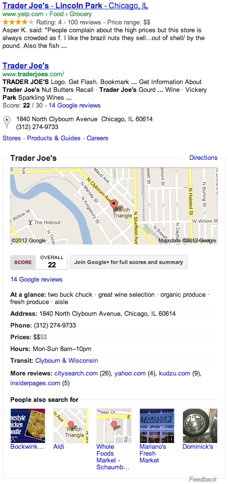
Google uses microdata to identify business locations, contact information, hours, pricing, ratings, and more.
Microdata vs. Microformats vs. RDFa
There are actually a handful of rich, structured data standards, including microdata, microformats, and RDFa. All of these have their pros and cons, and all of which are still viable to practice.
Microdata is the recommended format from Google, and other search engines, as well as part of the HTML5 specification. It uses findings from both microformats and RDFa to base it’s design around, thus looking to be a solid choice, and the one covered here. It is, however, recommended you do your research, take the pulse of the community, find what works best for your situation, and use that. Using one of these standards is substantially better than not using any. Find what will provide the best benefit for your users.
Outlining Microdata
Microdata is identified using three main attributes, itemscope, itemtype, and itemprop.
The itemscope Boolean attribute declares the scope of each microdata item. Place this attribute on the parent element where all of the microdata information pertaining to this item should reside.
Once you have determined the scope, use the itemtype attribute to identify what microdata vocabulary should be used. Generally speaking, some of the more popular microdata item types have been outlined at Schema.org. There are, however, other websites which outline additional, and different, item types. You may also write your own item types should you find the need.
1
2
3
4
<section itemscope itemtype="http://schema.org/Person">
...
</section>
Once the scope and type of the item have been determined, properties may then be set. These properties are identified by different elements which include the itemprop attribute. The value of this attribute determines what property is being referenced, and the content within the element itself most commonly determines the value of the property.
1
2
3
4
<section itemscope itemtype="http://schema.org/Person">
<h1 itemprop="name">Shay Howe</h1>
</section>
Some elements, however, do not get their itemprop value from the content within the element. Instead, their value is determined from the value of another attribute on the element. The table below outlines these one-off elements and what attribute is used for their property value.
| Element | Value |
|---|---|
<meta> |
content attribute |
<audio>, <embed>, <iframe>, <img>, <source>, <video> |
src attribute |
<a>, <area>, <link> |
href attribute |
<object> |
data attribute |
<time> |
datetime attribute |
Person Microdata
When referring to a person the person microdata library should be used. Below is an example of what a person microdata item might look like. Please notice, the person item type is used, as is the postal address item type within it. Also, please notice the different item properties and their corresponding values.
1
2
3
4
5
6
7
8
9
10
11
12
13
14
15
<section itemscope itemtype="http://schema.org/Person">
<strong itemprop="name">Shay Howe</strong>
<img src="shay.jpg" itemprop="image" alt="Shay Howe">
<div itemprop="jobTitle">Designer and Front-end Developer</div>
<a href="http://www.shayhowe.com" itemprop="url">shayhowe.com</a>
<div itemprop="telephone">(555) 123-4567</div>
<a href="mailto:[email protected]" itemprop="email">[email protected]</a>
<address itemprop="address" itemscope itemtype="http://schema.org/PostalAddress">
<span itemprop="streetAddress">600 W. Chicago Ave.</span>
<span itemprop="addressLocality">Chicago</span>,
<abbr itemprop="addressRegion" title="Illinois">IL</abbr>
<span itemprop="postalCode">60654</span>
</address>
</section>
Person Microdata Demo
See the Pen Download Attribute by Shay Howe (@shayhowe) on CodePen.
Please keep in mind, this code is for an individual person. Should you wish to refer to an organization, a more specific organization microdata library should be followed.
Event Microdata
The event microdata is very similar to that of the person microdata, however it uses the event microdata library instead. Common property similarities between the two can be identified, as can some of the nested item types.
1
2
3
4
5
6
7
8
9
10
11
12
13
14
15
16
<section itemscope itemtype="http://schema.org/Event">
<a itemprop="url" href="#">
<span itemprop="name">Styles Conference</span>
</a>
<time itemprop="startDate" datetime="2014-08-2409:00">Sunday, August 24, 2014 at 9:00 a.m.</time>
<div itemprop="location" itemscope itemtype="http://schema.org/Place">
<a itemprop="url" href="http://www.thechicagotheatre.com/">Chicago Theatre</a>
<address itemprop="address" itemscope itemtype="http://schema.org/PostalAddress">
<div itemprop="streetAddress">175 N. State St.</div>
<span itemprop="addressLocality">Chicago</span>,
<abbr itemprop="addressRegion" title="Illinois">IL</abbr>
<span itemprop="postalCode">60601</span>
</address>
</div>
</section>
Event Microdata Demo
See the Pen Event Microdata by Shay Howe (@shayhowe) on CodePen.
Microdata provides a lot of ways to further extend the content of a page. We have only touched the surface here. Further information on microdata may be found at Dive Into HTML5 Microdata and WHATWG Microdata.
WAI-ARIA
WAI-ARIA, also know as Web Accessibility Initiative — Accessible Rich Internet Applications, is a specification that helps make web pages and applications more accessible to those with disabilities. Specifically, WAI-ARIA helps define roles (for what blocks of content do), states (for how blocks of content are configured), and additional properties to support assistive technologies.
Roles
Setting WAI-ARIA roles is accomplished using the role attribute. These roles then specify what certain elements and blocks of content do on a page.
1
2
<header role="banner">...</header>
WAI-ARIA roles break down into four different categories, including abstract, widget, document structure, and landmark roles. For this lesson we will focus primarily on the document structure and landmark roles. Document structure roles define the organizational structure of content on a page, while landmark roles define the regions of a page. Specific role values for each of these categories are broken out below.
Document Structure Roles
-
article -
columnheader -
definition -
directory -
document -
group -
heading -
img -
list -
listitem -
math -
note -
presentation -
region -
row -
rowheader -
separator -
toolbar
Landmark Roles
-
application -
banner -
complementary -
contentinfo -
form -
main -
navigation -
search
HTML5 introduced a handful of new structural elements which commonly match up against the document structure and landmark roles. Exactly how these roles match up against specific elements may be seen below. Please notice, the header and footer elements do not have an implied role, and the acceptable roles for these elements may only be used once per page. That said, if you have multiple header and footer elements on a page the banner and contentinfo roles should be applied on the elements directly tied to the document from a top level perspective, not elements nested within other regions of the document structure.
| Element | Implied Role | Acceptable Roles |
|---|---|---|
article |
article |
application, article, document, or main |
aside |
complementary |
complementary, note, or search |
footer |
— | contentinfo (Only once per page) |
header |
— | banner (Only once per page) |
nav |
navigation |
navigation |
section |
region |
alert, alertdialog, application, contentinfo, dialog, document, log, main, marquee, region, search, or status |
Combining the elements with their matched roles in HTML5 would look like the following code snippet.
1
2
3
4
5
6
7
8
9
<header role="banner">
<nav role="navigation">...</nav>
</header>
<article role="article">
<section role="region">...</section>
</article>
<aside role="complementary">...</aside>
<footer role="contentinfo">...</footer>
States & Properties
In combination with WAI-ARIA roles there are also states and properties which help inform assistive technologies how content is configured. Like roles, the states and properties are broken into four categories, including widget attributes, live region attributes, drag-and-drop attributes, and relationship attributes
The widget attributes support widget roles and are specific to the user interface and where users take actions. The live region attributes may be applied to any element and are used to indicate content changes for assistive technologies, on page alerts and notifications for example. Drag-and-drop attributes supply information about drag-and-drop interface elements and provide alternate behaviors to assistive technologies. Lastly, relationship attributes outline the relationship between elements when the document structure cannot be determined.
Resources & Links
- Text-Level Semantics via WHATWG
- Existing rel Values via Microformats.org
- Organization of Schemas via Schema.org
- Microdata via Dive Into HTML5
- WAI-ARIA Overview via W3.org
- The Roles Model via W3.org