Lesson 10
Building Forms
Forms are an essential part of the Internet, as they provide a way for websites to capture information from users and to process requests, and they offer controls for nearly every imaginable use of an application. Through controls or fields, forms can request a small amount of information—often a search query or a username and password—or a large amount of information—perhaps shipping and billing information or an entire job application.
We need to know how to build forms in order to acquire user input. In this lesson we’ll discuss how to use HTML to mark up a form, which elements to use to capture different types of data, and how to style forms with CSS. We won’t get too deep into how information from a form is processed and handled on the back end of a website. Form processing is a deeper topic, outside the realm of this book; for now we’ll stick to the creation and styling of forms.
Initializing a Form
To add a form to a page, we’ll use the <form> element. The <form> element identifies where on the page control elements will appear. Additionally, the <form> element will wrap all of the elements included within the form, much like a <div> element.
1
2
3
4
<form action="/login" method="post">
...
</form>
A handful of different attributes can be applied to the <form> element, the most common of which are action and method. The action attribute contains the URL to which information included within the form will be sent for processing by the server. The method attribute is the HTTP method browsers should use to submit the form data. Both of these <form> attributes pertain to submitting and processing data.
Text Fields & Textareas
When it comes to gathering text input from users, there are a few different elements available for obtaining data within forms. Specifically, text fields and textareas are used for collecting text- or string-based data. This data may include passages of text content, passwords, telephone numbers, and other information.
Text Fields
One of the primary elements used to obtain text from users is the <input> element. The <input> element uses the type attribute to define what type of information is to be captured within the control. The most popular type attribute value is text, which denotes a single line of text input.
Along with setting a type attribute, it is best practice to give an <input> element a name attribute as well. The name attribute value is used as the name of the control and is submitted along with the input data to the server.
1
2
<input type="text" name="username">
Text Fields Demo
See the Pen Text Fields by Shay Howe (@shayhowe) on CodePen.
The <input> element is self-contained, meaning it uses only one tag and it does not wrap any other content. The value of the element is provided by its attributes and their corresponding values.
Originally, the only two text-based type attribute values were text and password (for password inputs); however, HTML5 brought along a handful of new type attribute values.
These values were added to provide clearer semantic meaning for inputs as well as to provide better controls for users. Should a browser not understand one of these HTML5 type attribute values, it will automatically fall back to the text attribute value. Below is a list of the new HTML5 input types.
colordatedatetimeemailmonthnumberrangesearchteltimeurlweek
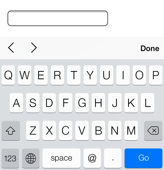
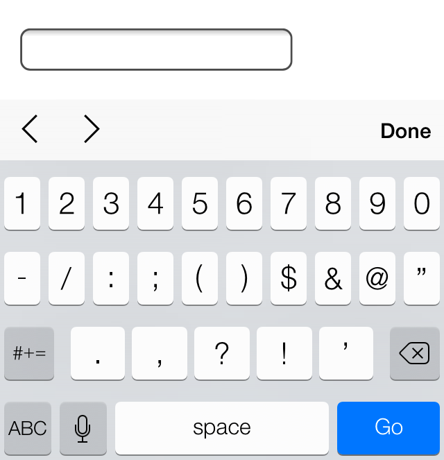
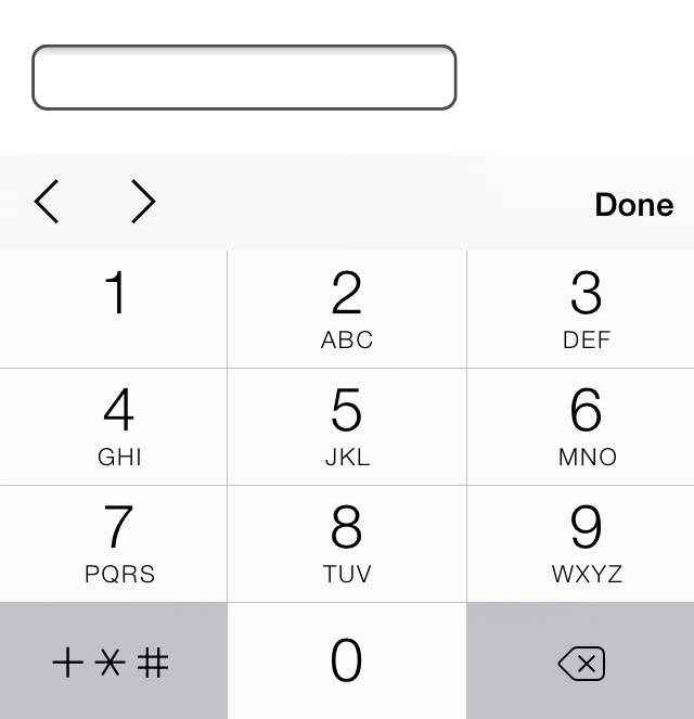
The following <input> elements show a few of these HTML5 type attribute values in use; the following figures show how these unique values may look within iOS. Notice how the different values provide different controls, all of which make gathering input from users easier.
1
2
3
4
5
6
7
<input type="date" name="birthday">
<input type="time" name="game-time">
<input type="email" name="email-address">
<input type="url" name="website">
<input type="number" name="cost">
<input type="tel" name="phone-number">
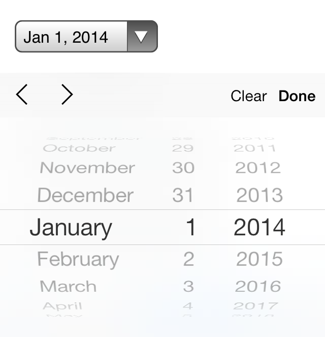
iOS7 controls for an <input> element with a type attribute value of date
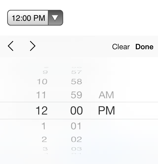
iOS7 controls for an <input> element with a type attribute value of time
iOS7 controls for an <input> element with a type attribute value of email

iOS7 controls for an <input> element with a type attribute value of url
iOS7 controls for an <input> element with a type attribute value of number
iOS7 controls for an <input> element with a type attribute value of tel
Textarea
Another element that’s used to capture text-based data is the <textarea> element. The <textarea> element differs from the <input> element in that it can accept larger passages of text spanning multiple lines. The <textarea> element also has start and end tags that can wrap plain text. Because the <textarea> element only accepts one type of value, the type attribute doesn’t apply here, but the name attribute is still used.
1
2
<textarea name="comment">Add your comment here</textarea>
The <textarea> element has two sizing attributes: cols for width in terms of the average character width and rows for height in terms of the number of lines of visible text. The size of a textarea, however, is more commonly identified using the width and height properties within CSS.
Multiple Choice Inputs & Menus
Apart from text-based input controls, HTML also allows users to select data using multiple choice and drop-down lists. There are a few different options and elements for these form controls, each of which has distinctive benefits.
Radio Buttons
Radio buttons are an easy way to allow users to make a quick choice from a small list of options. Radio buttons permit users to select one option only, as opposed to multiple options.
To create a radio button, the <input> element is used with a type attribute value of radio. Each radio button element should have the same name attribute value so that all of the buttons within a group correspond to one another.
With text-based inputs, the value of an input is determined by what a user types in; with radio buttons a user is making a multiple choice selection. Thus, we have to define the input value. Using the value attribute, we can set a specific value for each <input> element.
Additionally, to preselect a radio button for users we can use the Boolean attribute checked.
1
2
3
4
<input type="radio" name="day" value="Friday" checked> Friday
<input type="radio" name="day" value="Saturday"> Saturday
<input type="radio" name="day" value="Sunday"> Sunday
Radio Buttons Demo
See the Pen Radio Buttons by Shay Howe (@shayhowe) on CodePen.
Check Boxes
Check boxes are very similar to radio buttons. They use the same attributes and patterns, with the exception of checkbox as their type attribute value. The difference between the two is that check boxes allow users to select multiple values and tie them all to one control name, while radio buttons limit users to one value.
1
2
3
4
<input type="checkbox" name="day" value="Friday" checked> Friday
<input type="checkbox" name="day" value="Saturday"> Saturday
<input type="checkbox" name="day" value="Sunday"> Sunday
Check Boxes Demo
See the Pen Check Boxes by Shay Howe (@shayhowe) on CodePen.
Drop-Down Lists
Drop-down lists are a perfect way to provide users with a long list of options in a practi- cal manner. A long column of radio buttons next to a list of different options is not only visually unappealing, it’s daunting and difficult for users to comprehend, especially those on a mobile device. Drop-down lists, on the other hand, provide the perfect format for a long list of choices.
To create a drop-down list we’ll use the <select> and <option> elements. The <select> element wraps all of the menu options, and each menu option is marked up using the <option> element.
The name attribute resides on the <select> element, and the value attribute resides on the <option> elements that are nested within the <select> element. The value attribute on each <option> element then corresponds to the name attribute on the <select> element.
Each <option> element wraps the text (which is visible to users) of an individual option within the list.
Much like the checked Boolean attribute for radio buttons and check boxes, drop-down menus can use the selected Boolean attribute to preselect an option for users.
1
2
3
4
5
6
<select name="day">
<option value="Friday" selected>Friday</option>
<option value="Saturday">Saturday</option>
<option value="Sunday">Sunday</option>
</select>
Drop-Down Lists Demo
See the Pen Drop-Down Lists by Shay Howe (@shayhowe) on CodePen.
Multiple Selections
The Boolean attribute multiple, when added to the <select> element for a standard drop-down list, allows a user to choose more than one option from the list at a time. Additionally, using the selected Boolean attribute on more than one <option> element within the menu will preselect multiple options.
The size of the <select> element can be controlled using CSS and should be adjusted appropriately to allow for multiple selections. It may be worthwhile to inform users that to choose multiple options they will need to hold down the Shift key while clicking to make their selections.
1
2
3
4
5
6
<select name="day" multiple>
<option value="Friday" selected>Friday</option>
<option value="Saturday">Saturday</option>
<option value="Sunday">Sunday</option>
</select>
Multiple Selections Demo
See the Pen Multiple Selections by Shay Howe (@shayhowe) on CodePen.
Form Buttons
After a user inputs the requested information, buttons allow the user to put that infor- mation into action. Most commonly, a submit input or submit button is used to process the data.
Submit Input
Users click the submit button to process data after filling out a form. The submit button is created using the <input> element with a type attribute value of submit. The value attribute is used to specify the text that appears within the button.
1
2
<input type="submit" name="submit" value="Send">
Submit Input Demo
See the Pen Submit Input by Shay Howe (@shayhowe) on CodePen.
Submit Button
As an <input> element, the submit button is self-contained and cannot wrap any other content. If more control over the structure and design of the input is desired—along with the ability to wrap other elements—the <button> element may be used.
The <button> element performs the same way as the <input> element with the type attribute value of submit; however, it includes opening and closing tags, which may wrap other elements. By default, the <button> element acts as if it has a type attribute value of submit, so the type attribute and value may be omitted from the <button> element if you wish.
Rather than using the value attribute to control the text within the submit button, the text that appears between the opening and closing tags of the <button> element will appear.
1
2
3
4
<button name="submit">
<strong>Send Us</strong> a Message
</button>
Submit Button Demo
See the Pen Submit Button by Shay Howe (@shayhowe) on CodePen.
Other Inputs
Besides the applications we’ve just discussed, the <input> element has a few other use cases. These include passing hidden data and attaching files during form processing.
Hidden Input
Hidden inputs provide a way to pass data to the server without displaying it to users. Hidden inputs are typically used for tracking codes, keys, or other information that is not pertinent to the user but is helpful when processing the form. This information is not displayed on the page; however, it can be found by viewing the source code of a page. It should therefore not be used for sensitive or secure information.
To create a hidden input, you use the hidden value for the type attribute. Additionally, include the appropriate name and value attribute values.
1
2
<input type="hidden" name="tracking-code" value="abc-123">
File Input
To allow users to add a file to a form, much like attaching a file to an email, use the file value for the type attribute.
1
2
<input type="file" name="file">
File Input Demo
See the Pen File Input by Shay Howe (@shayhowe) on CodePen.
Unfortunately, styling an <input> element that has a type attribute value of file is a tough task with CSS. Each browser has its own default input style, and none provide much control to override the default styling. JavaScript and other solutions can be employed to allow for file input, but they are slightly more difficult to construct.
Organizing Form Elements
Knowing how to capture data with inputs is half the battle. Organizing form elements and controls in a usable manner is the other half. When interacting with forms, users need to understand what is being asked of them and how to provide the requested information.
By using labels, fieldsets, and legends, we can better organize forms and guide users to properly complete them.
Label
Labels provide captions or headings for form controls, unambiguously tying them together and creating an accessible form for all users and assistive technologies. Created using the <label> element, labels should include text that describes the inputs or controls they pertain to.
Labels may include a for attribute. The value of the for attribute should be the same as the value of the id attribute on the form control the label corresponds to. Matching up the for and id attribute values ties the two elements together, allowing users to click on the <label> element to bring focus to the proper form control.
1
2
3
<label for="username">Username</label>
<input type="text" name="username" id="username">
If desired, the <label> element may wrap form controls, such as radio buttons or check boxes. Doing so allows omission of the for and id attributes.
1
2
3
4
5
6
7
8
9
10
<label>
<input type="radio" name="day" value="Friday" checked> Friday
</label>
<label>
<input type="radio" name="day" value="Saturday"> Saturday
</label>
<label>
<input type="radio" name="day" value="Sunday"> Sunday
</label>
Labels with Nested Inputs Demo
See the Pen Labels with Nested Inputs by Shay Howe (@shayhowe) on CodePen.
Fieldset
Fieldsets group form controls and labels into organized sections. Much like a <section> or other structural element, the <fieldset> is a block-level element that wraps related elements, specifically within a <form> element, for better organization. Fieldsets, by default, also include a border outline, which can be modified using CSS.
1
2
3
4
5
6
7
8
9
10
11
<fieldset>
<label>
Username
<input type="text" name="username">
</label>
<label>
Password
<input type="text" name="password">
</label>
</fieldset>
Legend
A legend provides a caption, or heading, for the <fieldset> element. The <legend> element wraps text describing the form controls that fall within the fieldset. The markup should include the <legend> element directly after the opening <fieldset> tag. On the page, the legend will appear within the top left part of the fieldset border.
1
2
3
4
5
6
7
8
9
10
11
12
<fieldset>
<legend>Login</legend>
<label>
Username
<input type="text" name="username">
</label>
<label>
Password
<input type="text" name="password">
</label>
</fieldset>
Form & Input Attributes
To accommodate all of the different form, input, and control elements, there are a number of attributes and corresponding values. These attributes and values serve a handful of different functions, such as disabling controls and adding form validation. Described next are some of the more frequently used and helpful attributes.
Disabled
The disabled Boolean attribute turns off an element or control so that it is not available for interaction or input. Elements that are disabled will not send any value to the server for form processing.
Applying the disabled Boolean attribute to a <fieldset> element will disable all of the form controls within the fieldset. If the type attribute has a hidden value, the hidden Boolean attribute is ignored.
1
2
3
4
5
<label>
Username
<input type="text" name="username" disabled>
</label>
Placeholder
The placeholder HTML5 attribute provides a hint or tip within the form control of an <input> or <textarea> element that disappears once the control is clicked in or gains focus. This is used to give users further information on how the form input should be filled in, for example, the email address format to use.
1
2
3
4
5
<label>
Email Address
<input type="email" name="email-address" placeholder="[email protected]">
</label>
Placeholder Demo
See the Pen Placeholder by Shay Howe (@shayhowe) on CodePen.
The main difference between the placeholder and value attributes is that the value attribute value text stays in place when a control has focus unless a user manually deletes it. This is great for pre-populating data, such as personal information, for a user but not for providing suggestions.
Required
The required HTML5 Boolean attribute enforces that an element or form control must contain a value upon being submitted to the server. Should an element or form control not have a value, an error message will be displayed requesting that the user complete the required field. Currently, error message styles are controlled by the browser and cannot be styled with CSS. Invalid elements and form controls, on the other hand, can be styled using the :optional and :required CSS pseudo-classes.
Validation also occurs specific to a control’s type. For example, an <input> element with a type attribute value of email will require not only that a value exist within the control, but also that it is a valid email address.
1
2
3
4
5
<label>
Email Address
<input type="email" name="email-address" required>
</label>
Additional Attributes
Other form and form control attributes include, but are not limited to, the following. Please feel free to research these attributes as necessary.
acceptautocompleteautofocusformactionformenctypeformmethodformnovalidateformtargetmaxmaxlengthminpatternreadonlyselectionDirectionstep
Login Form Example
The following is an example of a complete login form that includes several different elements and attributes to illustrate what we’ve covered so far. These elements are then styled using CSS.
HTML
1
2
3
4
5
6
7
8
9
10
11
12
13
14
15
16
17
18
19
<form>
<fieldset class="account-info">
<label>
Username
<input type="text" name="username">
</label>
<label>
Password
<input type="password" name="password">
</label>
</fieldset>
<fieldset class="account-action">
<input class="btn" type="submit" name="submit" value="Login">
<label>
<input type="checkbox" name="remember"> Stay signed in
</label>
</fieldset>
</form>
CSS
1
2
3
4
5
6
7
8
9
10
11
12
13
14
15
16
17
18
19
20
21
22
23
24
25
26
27
28
29
30
31
32
33
34
35
36
37
38
39
40
41
42
43
44
45
46
47
48
49
50
51
52
53
54
55
56
57
58
59
60
61
*,
*:before,
*:after {
box-sizing: border-box;
}
form {
border: 1px solid #c6c7cc;
border-radius: 5px;
font: 14px/1.4 "Helvetica Neue", Helvetica, Arial, sans-serif;
overflow: hidden;
width: 240px;
}
fieldset {
border: 0;
margin: 0;
padding: 0;
}
input {
border-radius: 5px;
font: 14px/1.4 "Helvetica Neue", Helvetica, Arial, sans-serif;
margin: 0;
}
.account-info {
padding: 20px 20px 0 20px;
}
.account-info label {
color: #395870;
display: block;
font-weight: bold;
margin-bottom: 20px;
}
.account-info input {
background: #fff;
border: 1px solid #c6c7cc;
box-shadow: inset 0 1px 1px rgba(0, 0, 0, .1);
color: #636466;
padding: 6px;
margin-top: 6px;
width: 100%;
}
.account-action {
background: #f0f0f2;
border-top: 1px solid #c6c7cc;
padding: 20px;
}
.account-action .btn {
background: linear-gradient(#49708f, #293f50);
border: 0;
color: #fff;
cursor: pointer;
font-weight: bold;
float: left;
padding: 8px 16px;
}
.account-action label {
color: #7c7c80;
font-size: 12px;
float: left;
margin: 10px 0 0 20px;
}
Required Demo
See the Pen Login Form by Shay Howe (@shayhowe) on CodePen.
In Practice
With an understanding of how to build forms in place, let’s create a registration page for our Styles Conference website so that we can begin to gather interest and sell tickets for the event.
-
Jumping into our
register.htmlfile, we’ll begin by following the same layout pattern we used on our Speakers and Venue pages. This includes adding a<section>element with a class attribute value ofrowjust below the registration lead-in section and nesting a<div>element with a class attribute value ofgriddirectly inside the<section>element.Our code just below the lead-in section for the Register page should look like this:
1 2 3 4 5 6
<section class="row"> <div class="grid"> ... </div> </section>
As a refresher, the class attribute value of
rowadds a whitebackgroundand provides some verticalpadding, while the class attribute value ofgridcenters our content in the middle of the page and provides some horizontalpadding. -
Inside the
<div>element with a class attribute value ofgridwe’re going to create two columns, one covering two-thirds of the page width and one covering one-third of the page width. The two-thirds column will be a<section>element on the left- hand side that tells users why they should register for our conference. The one-third column, then, will be a<form>element on the right-hand side providing a way for users to register for our conference.We’ll add these two elements, and their corresponding
col-2-3andcol-1-3classes, directly inside the<div>element with a class attribute value ofgrid. Since both of these elements will be inline-block elements, we need to open a comment directly after the two-thirds column closing tag and then close that comment directly before the one-third column opening tag.In all, our code should look like this:
1 2 3 4 5 6 7 8 9 10 11 12 13 14
<section class="row"> <div class="grid"> <section class="col-2-3"> ... </section><!-- --><form class="col-1-3"> ... </form> </div> </section>
-
Now, inside our two-thirds column let’s add some details about our event and why it’s a good idea for aspiring designers and front-end developers to attend. We’ll do so using a handful of different heading levels (along with their pre-established styles), a paragraph, and an unordered list.
In our
<section>element with a class attribute value ofcol-2-3, the code should look like this:1 2 3 4 5 6 7 8 9 10 11 12 13 14 15 16 17 18
<section class="col-2-3"> <h2>Purchase a Conference Pass</h2> <h5>$99 per Pass</h5> <p>Purchase your Styles Conference pass using the form to the right. Multiple passes may be purchased within the same order, so feel free to bring a friend or two along. Once your order is finished we’ll follow up and provide a receipt for your purchase. See you soon!</p> <h4>Why Attend?</h4> <ul> <li>Over twenty world-class speakers</li> <li>One full day of workshops and two full days of presentations</li> <li>Hosted at The Chicago Theatre, a historical landmark</li> <li>August in Chicago is simply amazing</li> </ul> </section>
-
Currently our unordered list doesn’t have any list item markers. All of the browser default styles have been turned off by the CSS reset we added all the way back in Lesson 1. Let’s create some custom styles specifically for this unordered list.
To do so, let’s add a
classattribute value ofwhy-attendto the unordered list.1 2 3 4
<ul class="why-attend"> ... </ul>
With a class available to add styles to, let’s create a new section for Register page styles at the bottom of our
main.cssfile. Within this section let’s use the class to select the unordered list and add alist-styleofsquareand some bottom and left margins.The new section at the bottom of our
main.cssfile should look like this:1 2 3 4 5 6 7 8 9 10 11
/* ======================================== Register ======================================== */ .why-attend { list-style: square; margin: 0 0 22px 30px; }
-
The details section of our registration page is complete, so now it’s time to address our registration form. We’ll start by adding the
actionandmethodattributes to the<form>element. Since we haven’t set up our form processing, these attributes will simply serve as placeholders and will need to be revisited.The code for our
<form>element should look like this:1 2 3 4
<form class="col-1-3" action="#" method="post"> ... </form>
-
Next, inside the
<form>element we’ll add a<fieldset>element. Inside the<fieldset>element we’ll add a series of<label>elements that wrap a given form control.We want to collect a user’s name, email address, number of desired conference passes, and any potential comments. The name, email address, and number of conference passes are required fields, and we’ll want to make sure we use the appropriate elements and attributes for each form control.
With a mix of different input types, select menus, textareas, and attributes, the code for our form should look like the following:
1 2 3 4 5 6 7 8 9 10 11 12 13 14 15 16 17 18 19 20 21 22 23 24 25 26 27 28 29 30 31 32 33 34 35 36
<form class="col-1-3" action="#" method="post"> <fieldset> <label> Name <input type="text" name="name" placeholder="Full name" required> </label> <label> Email <input type="email" name="email" placeholder="Email address" required> </label> <label> Number of Passes <select name="quantity" required> <option value="1" selected>1</option> <option value="2">2</option> <option value="3">3</option> <option value="4">4</option> <option value="5">5</option> </select> </label> <label> Comments <textarea name="comments"></textarea> </label> </fieldset> <input type="submit" name="submit" value="Purchase"> </form>
Here we can see each form control nested within a
<label>element. The Name form control uses an<input>element with atypeattribute value oftext, while the Email form control uses an<input>element with atypeattribute value ofemail.Both the Name and Email form controls include the
requiredBoolean attribute and aplaceholderattribute.The Number of Passes form control uses the
<select>element and nested<option>elements. The<select>element itself includes therequiredBoolean attribute, and the first<option>element includes theselectedBoolean attribute.The Comments form control uses the
<textarea>element without any special modifications. And lastly, outside of the<fieldset>element is the submit form control, which is formed by an<input>element with atypeattribute value ofsubmit. -
With the form in place, it’s time to add styles to it. We’ll begin with a few default styles on the
<form>element itself and on the<input>,<select>, and<textarea>elements.Within the register section of our
main.cssfile we’ll want to add the following styles:1 2 3 4 5 6 7 8 9
form { margin-bottom: 22px; } input, select, textarea { font: 300 16px/22px "Lato", "Open Sans", "Helvetica Neue", Helvetica, Arial, sans-serif; }
We’ll start by placing a
22-pixelmarginon the bottom of our form to help vertically space it apart from other elements. Then we’ll add some standardfont-based styles—includingweight,size,line-height, andfamily—for all of the<input>,<select>, and<textarea>elements.By default, every browser has its own interpretation of how the styles for form controls should appear. With this in mind, we have repeated the
font-based styles from our<body>element to ensure that our styles remain consistent. -
Let’s add some styles to the elements within the
<fieldset>element. Since we may add additional<fieldset>elements later on, let’s add a class attribute value ofregister-groupto our existing<fieldset>element, and from there we can apply unique styles to the elements nested within it.1 2 3 4
<fieldset class="register-group"> ... </fieldset>
Once the
register-groupclass attribute value is in place, we’ll add a few styles to the elements nested within the<fieldset>element. These styles will appear in ourmain.cssfile, below the existing form styles.1 2 3 4 5 6 7 8 9 10 11 12 13 14 15 16 17 18 19 20 21 22 23 24 25 26 27
.register-group label { color: #648880; cursor: pointer; font-weight: 400; } .register-group input, .register-group select, .register-group textarea { border: 1px solid #c6c9cc; border-radius: 5px; color: #888; display: block; margin: 5px 0 27px 0; padding: 5px 8px; } .register-group input, .register-group textarea { width: 100%; } .register-group select { height: 34px; width: 60px; } .register-group textarea { height: 78px; }
You’ll notice that most of these properties and values revolve around the box model, which we covered in Lesson 4. We’re primarily setting up the size of different form controls, ensuring that they are laid out appropriately. Aside from adding some box model styles, we’re adjusting the
colorandfont-weightof a few elements. -
So far, so good: our form is coming together quite nicely. The only remaining element yet to be styled is the submit button. As it’s a button, we actually have some existing styles we can apply here. If we think back to our home page, our hero section contained a button that received some styles by way of the
btnclass attribute value.Let’s add this
classattribute value,btn, along with a newclassattribute value ofbtn-defaultto our submit button. Specifically we’ll use the class name ofbtn-defaultsince this button is appearing on a whitebackgroundand will be the default style for buttons moving forward.1 2
<input class="btn btn-default" type="submit" name="submit" value="Purchase">
Now our submit button has some shared styles with the button on the home page. We’ll use the
btn-defaultclass attribute value to then apply some new styles to our submit button specifically.Going back to the buttons section of our
main.cssfile, let’s add the following:1 2 3 4 5 6 7 8 9 10
.btn-default { border: 0; background: #648880; padding: 11px 30px; font-size: 14px; } .btn-default:hover { background: #77a198; }
These new styles, which define the size and
backgroundof our submit button, are then combined with the existingbtnclass styles to create the final presentation of our submit button.
Our Register page is finished, and attendees can now begin to reserve their tickets.
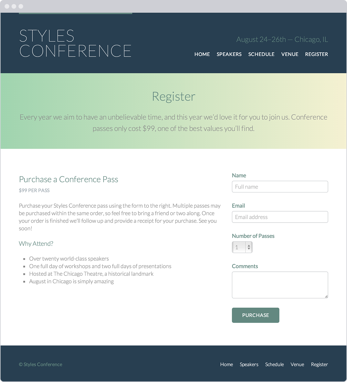
Our registration page, which includes a form
Demo & Source Code
Below you may view the Styles Conference website in its current state, as well as download the source code for the website in its current state.
View the Styles Conference Website or Download the Source Code (Zip file)
Summary
Forms play a large role in how users interact with, provide information to, and take action on websites. We’ve taken all the right steps to learn not only how to mark up forms but also how to style them.
To quickly recap, within this lesson we discussed the following:
- How to initialize a form
- Ways to obtain text-based information from users
- Different elements and methods for creating multiple choice options and menus
- Which elements and attributes are best used to submit a form’s data for processing
- How best to organize forms and give form controls structure and meaning
- A handful of attributes that help collect more qualified data
Our understanding of HTML and CSS is progressing quite nicely, and we only have one more component to learn: tables. In the next chapter, we’ll take a look at how to organize and present data with tables.
Resources & Links
- Forms via HTML Dog
- Form Element via Mozilla Developer Network
- Input Element via Mozilla Developer Network
- A Form of Madness via Dive Into HTML5