Lesson 3
Getting to Know CSS
CSS is a complex language that packs quite a bit of power.
It allows us to add layout and design to our pages, and it allows us to share those styles from element to element and page to page. Before we can unlock all of its features, though, there are a few aspects of the language we must fully understand.
First, it’s crucial to know exactly how styles are rendered. Specifically, we’ll need to know how different types of selectors work and how the order of those selectors can affect how our styles are rendered. We’ll also want to understand a few common property values that continually appear within CSS, particularly those that deal with color and length.
Let’s look under the hood of CSS to see exactly what is going on.
The Cascade
We’ll begin breaking down exactly how styles are rendered by looking at what is known as the cascade and studying a few examples of the cascade in action. Within CSS, all styles cascade from the top of a style sheet to the bottom, allowing different styles to be added or overwritten as the style sheet progresses.
For example, say we select all paragraph elements at the top of our style sheet and set their background color to orange and their font size to 24 pixels. Then towards the bottom of our style sheet, we select all paragraph elements again and set their background color to green, as seen here.
1
2
3
4
5
6
7
8
p {
background: orange;
font-size: 24px;
}
p {
background: green;
}
Because the paragraph selector that sets the background color to green comes after the paragraph selector that sets the background color to orange, it will take precedence in the cascade. All of the paragraphs will appear with a green background. The font size will remain 24 pixels because the second paragraph selector didn’t identify a new font size.
Cascading Properties
The cascade also works with properties inside individual selectors. Again, for example, say we select all the paragraph elements and set their background color to orange. Then directly below the orange background property and value declaration, we add another property and value declaration setting the background color to green, as seen here.
1
2
3
4
5
p {
background: orange;
background: green;
}
Because the green background color declaration comes after the orange background color declaration, it will overrule the orange background, and, as before, our paragraphs will appear with a green background.
All styles will cascade from the top of our style sheet to the bottom of our style sheet. There are, however, times where the cascade doesn’t play so nicely. Those times occur when different types of selectors are used and the specificity of those selectors breaks the cascade. Let’s take a look.
Calculating Specificity
Every selector in CSS has a specificity weight. A selector’s specificity weight, along with its placement in the cascade, identifies how its styles will be rendered.
In Lesson 1, “Building Your First Web Page,” we talked about three different types of selectors: the type, class, and ID selectors. Each of these selectors has a different specificity weight.
The type selector has the lowest specificity weight and holds a point value of 0-0-1. The class selector has a medium specificity weight and holds a point value of 0-1-0. Lastly, the ID selector has a high specificity weight and holds a point value of 1-0-0. As we can see, specificity points are calculated using three columns. The first column counts ID selectors, the second column counts class selectors, and the third column counts type selectors.
What’s important to note here is that the ID selector has a higher specificity weight than the class selector, and the class selector has a higher specificity weight than the type selector.
Specificity Points
Specificity points are intentionally hyphenated, as their values are not computed from a base of 10. Class selectors do not hold a point value of 10, and ID selectors do not hold a point value of 100. Instead, these points should be read as 0-1-0 and 1-0-0 respectively. We’ll take a closer look at why these point values are hyphenated shortly, when we combine selectors.
The higher the specificity weight of a selector, the more superiority the selector is given when a styling conflict occurs. For example, if a paragraph element is selected using a type selector in one place and an ID selector in another, the ID selector will take precedence over the type selector regardless of where the ID selector appears in the cascade.
HTML
1
2
<p id="food">...</p>
CSS
1
2
3
4
5
6
7
#food {
background: green;
}
p {
background: orange;
}
Here we have a paragraph element with an id attribute value of food. Within our CSS, that paragraph is being selected by two different kinds of selectors: one type selector and one ID selector. Although the type selector comes after the ID selector in the cascade, the ID selector takes precedence over the type selector because it has a higher specificity weight; consequently the paragraph will appear with a green background.
The specificity weights of different types of selectors are incredibly important to remember. At times styles may not appear on elements as intended, and chances are the specificity weights of our selectors are breaking the cascade, therefore our styles are not appearing properly.
Understanding how the cascade and specificity work is a huge hurdle, and we’ll continue to cover this topic. For now, let’s look at how to be a little more particular and intentional with our selectors by combining them. Keep in mind that as we combine selectors, we’ll also be changing their specificity.
Combining Selectors
So far we’ve looked at how to use different types of selectors individually, but we also need to know how to use these selectors together. By combining selectors we can be more specific about which element or group of elements we’d like to select.
For example, say we want to select all paragraph elements that reside within an element with a class attribute value of hotdog and set their background color to brown. However, if one of those paragraphs happens to have the class attribute value of mustard, we want to set its background color to yellow. Our HTML and CSS may look like the following:
HTML
1
2
3
4
5
6
<div class="hotdog">
<p>...</p>
<p>...</p>
<p class="mustard">...</p>
</div>
CSS
1
2
3
4
5
6
7
.hotdog p {
background: brown;
}
.hotdog p.mustard {
background: yellow;
}
When selectors are combined they should be read from right to left. The selector farthest to the right, directly before the opening curly bracket, is known as the key selector. The key selector identifies exactly which element the styles will be applied to. Any selector to the left of the key selector will serve as a prequalifier.
The first combined selector above, .hotdog p, includes two selectors: a class and a type selector. These two selectors are separated by a single space. The key selector is a type selector targeting paragraph elements. And because this type selector is prequalified with a class selector of hotdog, the full combined selector will only select paragraph elements that reside within an element with a class attribute value of hotdog.
The second selector above, .hotdog p.mustard, includes three selectors: two class selectors and one type selector. The only difference between the second selector and the first selector is the addition of the class selector of mustard to the end of the paragraph type selector. Because the new class selector, mustard, falls all the way to the right of the combined selector, it is the key selector, and all of the individual selectors coming before it are now prequalifiers.
Spaces Within Selectors
Within the previous combined selector, .hotdog p.mustard, there is a space between the hotdog class selector and the paragraph type selector but not between the paragraph type selector and the mustard class selector. The use, and omission, of spaces makes a large difference in selectors.
Since there isn’t a space between the paragraph type selector and the mustard class selector that means the selector will only select paragraph elements with the class of mustard. If the paragraph type selector was removed, and the mustard class selector had spaces on both sides of it, it would select any element with the class of mustard, not just paragraphs.
The best practice is to not prefix a class selector with a type selector. Generally we want to select any element with a given class, not just one type of element. And following this best practice, our new combined selector would be better as .hotdog .mustard.
Reading the combined selector from right to left, it is targeting paragraphs with a class attribute value of mustard that reside within an element with the class attribute value of hotdog.
Different types of selectors can be combined to target any given element on a page. As we continue to write different combined selectors, we’ll see their powers come to life. Before we do that, though, let’s take a look at how combining selectors changes a selector’s specificity weight.
Specificity Within Combined Selectors
When selectors are combined, so are the specificity weights of the individual selectors. These combined specificity weights can be calculated by counting each different type of selector within a combined selector.
Looking at our combined selectors from before, the first selector, .hotdog p, had both a class selector and a type selector. Knowing that the point value of a class selector is 0-1-0 and the point value of a type selector is 0-0-1, the total combined point value would be 0-1-1, found by adding up each kind of selector.
The second selector, .hotdog p.mustard, had two class selectors and one type selector. Combined, the selector has a specificity point value of 0-2-1. The 0 in the first column is for zero ID selectors, the 2 in the second column is for two class selectors, and the 1 in the last column is for one type selector.
Comparing the two selectors, the second selector, with its two classes, has a noticeably higher specificity weight and point value. As such it will take precedence within the cascade. If we were to flip the order of these selectors within our style sheet, placing the higher-weighted selector above the lower-weighted selector as shown here, the appearance of their styles would not be affected due to each selector’s specificity weight.
1
2
3
4
5
6
7
.hotdog p.mustard {
background: yellow;
}
.hotdog p {
background: brown;
}
In general we want to always keep an eye on the specificity weights of our selectors. The higher our specificity weights rise, the more likely our cascade is to break.
Layering Styles with Multiple Classes
One way to keep the specificity weights of our selectors low is to be as modular as possible, sharing similar styles from element to element. And one way to be as modular as possible is to layer on different styles by using multiple classes.
Elements within HTML can have more than one class attribute value so long as each value is space separated. With that, we can place certain styles on all elements of one sort while placing other styles only on specific elements of that sort.
We can tie styles we want to continually reuse to one class and layer on additional styles from another class.
Let’s take a look at buttons, for example. Say we want all of our buttons to have a font size of 16 pixels, but we want the background color of our buttons to vary depending on where the buttons are used. We can create a few classes and layer them on an element as necessary to apply the desired styles.
HTML
1
2
3
<a class="btn btn-danger">...</a>
<a class="btn btn-success">...</a>
CSS
1
2
3
4
5
6
7
8
9
10
.btn {
font-size: 16px;
}
.btn-danger {
background: red;
}
.btn-success {
background: green;
}
Here you can see two anchor elements, both with multiple class attribute values. The first class, btn, is used to apply a font size of 16 pixels to each of the elements. Then, the first anchor element uses an additional class of btn-danger to apply a red background color while the second anchor element uses an additional class of btn-success to apply a green background color. Our styles here are clean and modular.
Using multiple classes, we can layer on as many styles as we wish, keeping our code lean and our specificity weights low. Much like understanding the cascade and calculating specificity, this is a practice that will take time to fully absorb, but we’ll get better with each lesson.
Common CSS Property Values
We’ve used a handful of common CSS property values already, such as the keyword color values of red and green. You may not have thought too much about them; that’s okay. We’re going to take time now to go over some previously used property values as well as to explore some of the more common property values that we’ll soon be using.
Specifically, we’ll look at property values that relate to colors and length measurements.
Colors
All color values within CSS are defined on an sRGB (or standard red, green, and blue) color space. Colors within this space are formed by mixing red, green, and blue color channels together, mirroring the way that televisions and monitors generate all the different colors they display. By mixing different levels of red, green, and blue, we can create millions of colors—and find nearly any color we’d like.
Currently there are four primary ways to represent sRGB colors within CSS: keywords, hexadecimal notation, and RGB and HSL values.
Keyword Colors
Keyword color values are names (such as red, green, or blue) that map to a given color. These keyword names and their corresponding colors are determined by the CSS specification. Most common colors, along with a few oddities, have keyword names.
A complete list of these keyword names can be found within the CSS specification.
| Color | Name | Hex Values | RGB Values | HSL Values |
|---|---|---|---|---|
black |
#000000 |
rgb(0, 0, 0) |
hsl(0, 0%, 0%) |
|
silver |
#c0c0c0 |
rgb(192, 192, 192) |
hsl(0, 0%, 75%) |
|
gray |
#808080 |
rgb(128, 128, 128) |
hsl(0, 0%, 50%) |
|
white |
#ffffff |
rgb(255, 255, 255) |
hsl(0, 100%, 100%) |
|
maroon |
#800000 |
rgb(128, 0, 0) |
hsl(0, 100%, 25%) |
|
red |
#ff0000 |
rgb(255, 0, 0) |
hsl(0, 100%, 50%) |
|
purple |
#800080 |
rgb(128, 0, 128) |
hsl(300, 100%, 25%) |
|
fuchsia |
#ff00ff |
rgb(255, 0, 255) |
hsl(300, 100%, 50%) |
|
green |
#008000 |
rgb(0, 128, 0) |
hsl(120, 100%, 25%) |
|
olive |
#808000 |
rgb(128, 128, 0) |
hsl(60, 100%, 25%) |
|
lime |
#00ff00 |
rgb(0, 255, 0) |
hsl(120, 100%, 50%) |
|
yellow |
#ffff00 |
rgb(255, 255, 0) |
hsl(60, 100%, 50%) |
|
navy |
#000080 |
rgb(0, 0, 128) |
hsl(240, 100%, 25%) |
|
blue |
#0000ff |
rgb(0, 0, 255) |
hsl(240, 100%, 50%) |
|
teal |
#008080 |
rgb(0, 128, 128) |
hsl(180, 100%, 25%) |
|
aqua |
#00ffff |
rgb(0, 255, 255) |
hsl(180, 100%, 50%) |
Here we are applying a maroon background to any element with the task class attribute value and a yellow background to any element with the count class attribute value.
1
2
3
4
5
6
7
.task {
background: maroon;
}
.count {
background: yellow;
}
While keyword color values are simple in nature, they provide limited options and thus are not the most popular color value choice.
Hexadecimal Colors
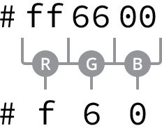
Hexadecimal color values consist of a pound, or hash, #, followed by a three- or six- character figure. The figures use the numbers 0 through 9 and the letters a through f, upper or lower case. These values map to the red, green, and blue color channels.
In six-character notation, the first two characters represent the red channel, the third and fourth characters represent the green channel, and the last two characters represent the blue channel. In three-character notation, the first character represents the red channel, the second character represents the green channel, and the last character represents the blue channel.
If in six-character notation the first two characters are a matching pair, the third and fourth characters are a matching pair, and the last two characters are a matching pair, the six-character figure may be shortened to a three-character figure. To do this the repeated character from each pair should be used once. For example, a shade of orange represented by the hexadecimal color #ff6600 could also be written as #f60.
Six-character hexadecimal values may be written as three-character hexadecimal values when the red, green, and blue color channels each contain a repeating character
The character pairs are obtained by converting 0 through 255 into a base-16, or hexadecimal, format. The math is a little tricky—and worthy of its own book—but it helps to know that 0 equals black and f equals white.
The Millions of Hexadecimal Colors
There are millions of hexadecimal colors, over 16.7 million to be exact. Here’s how…
There are 16 options for every character in a hexadecimal color, 0 through 9 and a through f. With the characters grouped in pairs, there are 256 color options per pair (16 multiplied by 16, or 16 squared).
And with three groups of 256 color options we have a total of over 16.7 million colors (256 multiplied by 256 multiplied by 256, or 256 cubed).
To create the same maroon and yellow background colors from before, we could replace the keyword color values with hexadecimal color values, as seen here.
1
2
3
4
5
6
7
.task {
background: #800000;
}
.count {
background: #ff0;
}
Hexadecimal color values have been around for a while, and they have become fairly popular because they offer a large number of color options. They are, however, a little difficult to work with, especially if you’re not too familiar with them. Fortunately Adobe has created Adobe Color, a free application that provides a color wheel to help us find any color we want and its corresponding hexadecimal value.
Additionally, most image editing applications, such as Adobe Photoshop, provide the capability to locate hexadecimal color values.
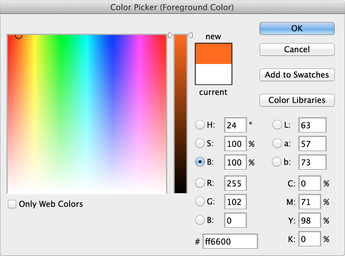
The color picker tool within Adobe Photoshop displays the hexadecimal and RGB color values
RGB & RGBa Colors
RGB color values are stated using the rgb() function, which stands for red, green, and blue. The function accepts three comma-separated values, each of which is an integer from 0 to 255. A value of 0 would be pure black; a value of 255 would be pure white.
As we might expect, the first value within the rgb() function represents the red channel, the second value represents the green channel, and the third value represents the blue channel.
If we were to recreate the shade of orange from before as an RGB color value, it would be represented as rgb(255, 102, 0).
Also, using the same maroon and yellow background colors from before, we could replace the keyword or hexadecimal color values with RGB color values.
1
2
3
4
5
6
7
.task {
background: rgb(128, 0, 0);
}
.count {
background: rgb(255, 255, 0);
}
RGB color values may also include an alpha, or transparency, channel by using the rgba() function. The rgba() function requires a fourth value, which must be a number between 0 and 1, including decimals. A value of 0 creates a fully transparent color, meaning it would be invisible, and a value of 1 creates a fully opaque color. Any decimal value in between 0 and 1 would create a semi-transparent color.
If we wanted our shade of orange to appear 50% opaque, we would use an RGBa color value of rgba(255, 102, 0, .5).
We can also change the opacity of our maroon and yellow background colors. The following code sets the maroon background color to 25% opaque and leaves the yellow background color 100% opaque.
1
2
3
4
5
6
7
.task {
background: rgba(128, 0, 0, .25);
}
.count {
background: rgba(255, 255, 0, 1);
}
RGB color values are becoming more popular, especially due to the ability to create semi-transparent colors using RGBa.
HSL & HSLa Colors
HSL color values are stated using the hsl() function, which stands for hue, saturation, and lightness. Within the parentheses, the function accepts three comma-separated values, much like rgb().
The first value, the hue, is a unitless number from 0 to 360. The numbers 0 through 360 represent the color wheel, and the value identifies the degree of a color on the color wheel.
The second and third values, the saturation and lightness, are percentage values from 0 to 100%. The saturation value identifies how saturated with color the hue is, with 0 being grayscale and 100% being fully saturated. The lightness identifies how dark or light the hue value is, with 0 being completely black and 100% being completely white.
Returning to our shade of orange, as an HSL color value it would be written as hsl(24, 100%, 50%).
Our maroon and yellow background colors can also be stated as HSL color values, as shown here.
1
2
3
4
5
6
7
.task {
background: hsl(0, 100%, 25%);
}
.count {
background: hsl(60, 100%, 50%);
}
HSL color values, like RGBa, may also include an alpha, or transparency, channel with the use of the hsla() function. The behavior of the alpha channel is just like that of the rgba() function. A fourth value between 0 and 1, including decimals, must be added to the function to identify the degree of opacity.
Our shade of orange as an HSLa color set to 50% opaque would be represented as hsla(24, 100%, 50%, .5).
The same 25% opaque maroon background color and 100% opaque yellow background color from before would look like the following as HSLa color values.
1
2
3
4
5
6
7
.task {
background: hsla(0, 100%, 25%, .25);
}
.count {
background: hsla(60, 100%, 50%, 1);
}
The HSL color value is the newest color value available within CSS. Due to its age and support within browsers, though, it isn’t as widely used as the other values.
For the time being, hexadecimal color values remain the most popular as they are widely supported; though when an alpha channel for transparency is needed, RGBa color values are preferred. These preferences may change in the future, but for now we’ll use hexadecimal and RGBa color values.
Lengths
Length values within CSS are similar to colors in that there are a handful of different types of values for length, all of which serve distinct purposes. Length values come in two different forms, absolute and relative, each of which uses different units of measurement.
We’re going to stick to the more common—and more straightforward—values at the moment, as more complex values will provide much more power than we need for now.
Absolute Lengths
Absolute length values are the simplest length values, as they are fixed to a physical measurement, such as inches, centimeters, or millimeters. The most popular absolute unit of measurement is known as the pixel and is represented by the px unit notation.
Pixels
The pixel is equal to 1/96th of an inch; thus there are 96 pixels in an inch. The exact measurement of a pixel, however, may vary slightly between high-density and low-density viewing devices.
Pixels have been around for quite some time and are commonly used with a handful of different properties. The code here is using pixels to set the font size of all paragraphs to 14 pixels.
1
2
3
4
p {
font-size: 14px;
}
With the changing landscape of viewing devices and their varying screen sizes, pixels have lost some of their popularity. As an absolute unit of measurement, they don’t provide too much flexibility. Pixels are, however, trustworthy and great for getting started. We’re going to lean on them quite a bit as we’re learning the ropes of HTML and CSS.
Relative Lengths
In addition to absolute length values, there are also relative length values. Relative length values are a little more complicated, as they are not fixed units of measurement; they rely on the length of another measurement.
Percentages
Percentages, represented by the % unit notation, are one of the most popular relative values. Percentage lengths are defined in relation to the length of another object. For example, to set the width of an element to 50%, we have to know the width of its parent element, the element it is nested within, and then identify 50% of the parent element’s width.
1
2
3
4
.col {
width: 50%;
}
Here we’ve set the width of the element with the class attribute value of col to 50%. That 50% will be calculated relative to the width of the element’s parent.
Percentages are extremely helpful for setting the height and width of elements and building out a web page’s layout. We’re going to rely on them often to help us out in these areas.
Em
The em unit is also a very popular relative value. The em unit is represented by the em unit notation, and its length is calculated based on an element’s font size.
A single em unit is equivalent to an element’s font size. So, for example, if an element has a font size of 14 pixels and a width set to 5em, the width would equal 70 pixels (14 pixels multiplied by 5).
1
2
3
4
5
.banner {
font-size: 14px;
width: 5em;
}
When a font size is not explicitly stated for an element, the em unit will be relative to the font size of the closest parent element with a stated font size.
The em unit is often used for styling text, including font sizes, as well as spacing around text, including margins and paddings. We’ll explore text a bit more in Lesson 6, “Working with Typography.”
There are a lot more absolute and relative units of measurement than those mentioned here. However, these three—pixels, percentages, and em units—are the most popular and the ones we’re going to primarily use.
Summary
Sadly our Styles Conference website lay dormant this lesson. We focused on the foundations of CSS, covering exactly how it works and some common values we’re sure to use.
To briefly recap, within this lesson we’ve discussed the following:
- How style sheets cascade from the top to the bottom of a file
- What specificity is and how we can calculate it
- How to combine selectors to target specific elements or groups of elements
- How to use multiple classes on a single element to layer on different styles for more modular code
- The different color values available to use within CSS, including keyword, hexadecimal, RGB, and HSL values
- The different length values available to use within CSS, including pixels, percentages, and em units
We still have a lot to cover, but the fundamentals are starting to fall into place. Within the next few lessons we’ll continue to dive in to CSS, and our website will really begin to take shape.
Resources & Links
- CSS Color Module via W3C
- Adobe Color
- CSS Length Values via Mozilla Developer Network