Lesson 11
Organizing Data with Tables
HTML tables were created to provide a straightforward way to mark up structured tabular data and to display that data in a form that is easy for users to read and digest.
When HTML was being developed, however, CSS was not widely supported in browsers, so tables were the primary means by which websites were built. They were used for positioning content as well as for building the overall layout of a page. This worked at the time, but it was not what table markup was intended for, and it led to many other associated problems.
Fortunately, we have come a long way since then. Today tables are used specifically for organizing data (like they should be), and CSS is free to get on with the jobs of positioning and layout.
Building data tables still has its challenges. How a table should be built in HTML depends largely on the data and how it is to be displayed. Then, once they’re marked up in HTML, tables need to be styled with CSS to make the information more legible and understandable to users.
Creating a Table
Tables are made up of data that is contained within columns and rows, and HTML supplies several different elements for defining and structuring these items. At a minimum a table must consist of <table>, <tr> (table row), and <td> (table data) elements. For greater structure and additional semantic value, tables may include the <th> (table header) ele- ment and a few other elements as well. When all of these elements are working together, they produce a solid table.
Table
We use the <table> element to initialize a table on a page. Using the <table> element signifies that the information within this element will be tabular data displayed in the necessary columns and rows.
1
2
3
4
<table>
...
</table>
Table Row
Once a table has been defined in HTML, table rows may be added using the <tr> element. A table can have numerous table rows, or <tr> elements. Depending on the amount of information there is to display, the number of table rows may be substantial.
1
2
3
4
5
6
7
8
9
<table>
<tr>
...
</tr>
<tr>
...
</tr>
</table>
Table Data
Once a table is defined and rows within that table have been set up, data cells may be added to the table via the table data, or <td>, element. Listing multiple <td> elements one after the other will create columns within a table row.
1
2
3
4
5
6
7
8
9
10
11
12
13
14
15
16
17
18
19
20
21
22
23
24
25
26
27
<table>
<tr>
<td>Don’t Make Me Think by Steve Krug</td>
<td>In Stock</td>
<td>1</td>
<td>$30.02</td>
</tr>
<tr>
<td>A Project Guide to UX Design by Russ Unger & Carolyn Chandler</td>
<td>In Stock</td>
<td>2</td>
<td>$52.94 ($26.47 × 2)</td>
</tr>
<tr>
<td>Introducing HTML5 by Bruce Lawson & Remy Sharp</td>
<td>Out of Stock</td>
<td>1</td>
<td>$22.23</td>
</tr>
<tr>
<td>Bulletproof Web Design by Dan Cederholm</td>
<td>In Stock</td>
<td>1</td>
<td>$30.17</td>
</tr>
</table>
Table Header
To designate a heading for a column or row of cells, the table header element, <th>, should be used. The <th> element works just like the <td> element in that it creates a cell for data. The value to using the <th> element over the <td> element is that the table header element provides semantic value by signifying that the data within the cell is a heading, while the <td> element only represents a generic piece of data.
The difference between the two elements is similar to the difference between headings (<h1> through <h6> elements) and paragraphs (<p> elements). While a heading’s content could be placed within a paragraph, it doesn’t make sense to do so. Specifically using a heading adds more semantic value to the content. The same is true for table headers.
Table headers may be used within both columns and rows; the data within a table determines where the headers are appropriate. The scope attribute helps to identify exactly what content a table header relates to. The scope attribute indicates with the values col, row, colgroup, and rowgroup whether a table header applies to a row or column. The most commonly used values are col and row. The col value indicates that every cell within the column relates directly to that table header, and the row value indicates that every cell within the row relates directly to that table header.
Using the <th> element, along with the scope attribute, tremendously helps screen readers and assistive technologies make sense of a table. Therefore, they are also beneficial to those browsing a web page using those technologies.
Additionally, depending on the browser, table headers may receive some default styling, usually bold and centered.
1
2
3
4
5
6
7
8
9
10
11
12
13
14
15
16
17
18
19
20
21
22
23
24
25
26
27
28
29
30
31
32
33
<table>
<tr>
<th scope="col">Item</th>
<th scope="col">Availability</th>
<th scope="col">Qty</th>
<th scope="col">Price</th>
</tr>
<tr>
<td>Don’t Make Me Think by Steve Krug</td>
<td>In Stock</td>
<td>1</td>
<td>$30.02</td>
</tr>
<tr>
<td>A Project Guide to UX Design by Russ Unger & Carolyn Chandler</td>
<td>In Stock</td>
<td>2</td>
<td>$52.94 ($26.47 × 2)</td>
</tr>
<tr>
<td>Introducing HTML5 by Bruce Lawson & Remy Sharp</td>
<td>Out of Stock</td>
<td>1</td>
<td>$22.23</td>
</tr>
<tr>
<td>Bulletproof Web Design by Dan Cederholm</td>
<td>In Stock</td>
<td>1</td>
<td>$30.17</td>
</tr>
</table>
Table Header Demo
See the Pen Table Header by Shay Howe (@shayhowe) on CodePen.
Getting data into a table is only the beginning. While we’ve scratched the surface of how to semantically add data to a table, there is more we can do to define the structure of our tables.
The Headers Attribute
The headers attribute is very similar to the scope attribute. By default, the scope attribute may only be used on the <th> element. In the case that a cell, either a <td> or <th> element, needs to be associated with a different header, the headers attribute comes into play. The value of the headers attribute on a <td> or <th> element needs to match the id attribute value of the <th> element that cell pertains to.
Table Structure
Knowing how to build a table and arrange data is extremely powerful; however, there are a few additional elements to help us organize the data and structure of a table. These elements include <caption>, <thead>, <tbody>, and <tfoot>.
Table Caption
The <caption> element provides a caption or title for a table. A caption will help users identify what the table pertains to and what data they can expect to find within it. The <caption> element must come immediately after the opening <table> tag, and it is positioned at the top of a table by default.
1
2
3
4
5
<table>
<caption>Design and Front-End Development Books</caption>
...
</table>
Table Caption Demo
See the Pen Table Caption by Shay Howe (@shayhowe) on CodePen.
Table Head, Body, & Foot
The content within tables can be broken up into multiple groups, including a head, a body, and a foot. The <thead> (table head), <tbody> (table body), and <tfoot> (table foot) elements help to structurally organize tables.
The table head element, <thead>, wraps the heading row or rows of a table to denote the head. The table head should be placed at the top of a table, after any <caption> element and before any <tbody> element.
After the table head may come either the <tbody> or <tfoot> elements. Originally the <tfoot> element had to come immediately after the <thead> element, but HTML5 has provided leeway here. These elements may now occur in any order so long as they are never parent elements of one another. The <tbody> element should contain the primary data within a table, while the <tfoot> element contains data that outlines the contents of a table.
1
2
3
4
5
6
7
8
9
10
11
12
13
14
15
16
17
18
19
20
21
22
23
24
25
26
27
28
29
30
31
32
33
34
35
36
37
38
39
40
41
<table>
<caption>Design and Front-End Development Books</caption>
<thead>
<tr>
<th scope="col">Item</th>
<th scope="col">Availability</th>
<th scope="col">Qty</th>
<th scope="col">Price</th>
</tr>
</thead>
<tbody>
<tr>
<td>Don’t Make Me Think by Steve Krug</td>
<td>In Stock</td>
<td>1</td>
<td>$30.02</td>
</tr>
...
</tbody>
<tfoot>
<tr>
<td>Subtotal</td>
<td></td>
<td></td>
<td>$135.36</td>
</tr>
<tr>
<td>Tax</td>
<td></td>
<td></td>
<td>$13.54</td>
</tr>
<tr>
<td>Total</td>
<td></td>
<td></td>
<td>$148.90</td>
</tr>
</tfoot>
</table>
Table Caption Demo
See the Pen Table Head, Body, & Foot by Shay Howe (@shayhowe) on CodePen.
Combining Multiple Cells
Often, two or more cells need to be combined into one without breaking the overall row and column layout. Perhaps two cells next to each other contain the same data, there’s an empty cell, or the cells should be combined for styling purposes. In these cases we can use the colspan and rowspan attributes. These two attributes work on either the <td> or <th> elements.
The colspan attribute is used to span a single cell across multiple columns within a table, while the rowspan attribute is used to span a single cell across multiple rows. Each attribute accepts an integer value that indicates the number of cells to span across, with 1 being the default value.
Using the table of books from before, we can now remove the empty table cells within the table footer as well as clean up the table header.
1
2
3
4
5
6
7
8
9
10
11
12
13
14
15
16
17
18
19
20
21
22
23
24
25
26
27
28
29
30
31
32
33
34
<table>
<caption>Design and Front-End Development Books</caption>
<thead>
<tr>
<th scope="col" colspan="2">Item</th>
<th scope="col">Qty</th>
<th scope="col">Price</th>
</tr>
</thead>
<tbody>
<tr>
<td>Don’t Make Me Think by Steve Krug</td>
<td>In Stock</td>
<td>1</td>
<td>$30.02</td>
</tr>
...
</tbody>
<tfoot>
<tr>
<td colspan="3">Subtotal</td>
<td>$135.36</td>
</tr>
<tr>
<td colspan="3">Tax</td>
<td>$13.54</td>
</tr>
<tr>
<td colspan="3">Total</td>
<td>$148.90</td>
</tr>
</tfoot>
</table>
Combining Multiple Cells Demo
See the Pen Combining Multiple Cells by Shay Howe (@shayhowe) on CodePen.
Table Borders
Effective use of borders can help make tables more comprehensible. Borders around a table or individual cells can make a large impact when a user is trying to interpret data and quickly scan for information. When styling table borders with CSS there are two properties that will quickly come in handy: border-collapse and border-spacing.
Border Collapse Property
Tables consist of a parent <table> element as well as nested <th> or <td> elements. When we apply borders around these elements those borders will begin to stack up, with the border of one element sitting next to that of another element. For example, if we put a 2-pixel border around an entire table and then an additional 2-pixel border around each table cell, there would be a 4-pixel border around every cell in the table.
The border-collapse property determines a table’s border model. There are three values for the border-collapse property: collapse, separate, and inherit. By default, the border-collapse property value is separate, meaning that all of the different borders will stack up next to one another, as described above. The collapse value, on the other hand, condenses the borders into one, choosing the table cell as the primary border.
1
2
3
4
5
6
7
8
9
table {
border-collapse: collapse;
}
th,
td {
border: 1px solid #cecfd5;
padding: 10px 15px;
}
Border Collapse Property Demo
See the Pen Border Collapse Property by Shay Howe (@shayhowe) on CodePen.
Border Spacing Property
As the border-collapse property with the separate value allows borders to be stacked up against one another, the border-spacing property can determine how much space, if any, appears between the borders.
For example, a table with a 1-pixel border around the entire table and a 1-pixel border around each cell will have a 2-pixel border all around every cell because the borders stack up next to one another. Adding in a border-spacing value of 4 pixels separates the borders by 4 pixels.
1
2
3
4
5
6
7
8
9
10
11
12
13
14
table {
border-collapse: separate;
border-spacing: 4px;
}
table,
th,
td {
border: 1px solid #cecfd5;
}
th,
td {
padding: 10px 15px;
}
Border Spacing Property Demo
See the Pen Border Spacing Property by Shay Howe (@shayhowe) on CodePen.
The border-spacing property works only when the border-collapse property value is separate, its default value. If the border-collapse property hasn’t been previously used, we can use the border-spacing property without worry.
Additionally, the border-spacing property may accept two length values: the first value for horizontal spacing and the second value for vertical spacing. The declaration border-spacing: 5px 10px;, for example, will place 5 pixels of horizontal spacing between borders and 10 pixels of vertical spacing between borders.
Adding Borders to Rows
Adding borders to a table can be tricky at times, particularly when putting borders between rows. Within a table, borders cannot be applied to <tr> elements or table structural elements, so when we want to put a border between rows some thought is required.
We’ll begin by making sure the table’s border-collapse property value is set to collapse, and then we’ll add a bottom border to each table cell, regardless of whether it’s a <th> or <td> element. If we wish, we can remove the bottom border from the cells within the last row of the table by using the :last-child pseudo-class selector to select the last <tr> element within the table and target the <td> elements within that row. Additionally, if a table is using the structural elements, we’ll want to make sure to prequalify the last row of the table as being within the <tfoot> element.
1
2
3
4
5
6
7
8
9
10
11
12
table {
border-collapse: collapse;
}
th,
td {
border-bottom: 1px solid #cecfd5;
padding: 10px 15px;
}
tfoot tr:last-child td {
border-bottom: 0;
}
Adding Borders to Rows Demo
See the Pen Adding Borders to Rows by Shay Howe (@shayhowe) on CodePen.
Table Striping
In the effort to make tables more legible, one common design practice is to “stripe” table rows with alternating background colors. This makes the rows clearer and provides a visual cue for scanning information. One way to do this is to place a class on every other <tr> element and set a background color to that class. Another, easier way is to use the :nth-child pseudo-class selector with an even or odd argument to select every other <tr> element.
Here, our table of books uses the :nth-child pseudo-class selector with an even argument to select all even table rows within the table and apply a gray background. Consequently, every other row within the table body is gray.
1
2
3
4
5
6
7
8
9
10
11
12
13
14
15
16
17
18
19
20
21
22
23
table {
border-collapse: separate;
border-spacing: 0;
}
th,
td {
padding: 10px 15px;
}
thead {
background: #395870;
color: #fff;
}
tbody tr:nth-child(even) {
background: #f0f0f2;
}
td {
border-bottom: 1px solid #cecfd5;
border-right: 1px solid #cecfd5;
}
td:first-child {
border-left: 1px solid #cecfd5;
}
Table Striping Demo
See the Pen Table Striping by Shay Howe (@shayhowe) on CodePen.
Within this code there are a few intricacies worth mentioning. To begin, the <table> element has an explicit border-collapse property set to separate and a border-spacing property set to 0. The reason for this is that the <td> elements include borders, while the <th> elements do not. Without the border-collapse property set to separate the borders of the <td> elements would make the body and foot of the table wider than the head.
Since the border-collapse property is set to separate we need to be careful as to how borders are applied to <td> elements. Here borders are set to the right and bottom of all <td> elements. Then, the very first <td> element within a <tr> element will receive a left border. As all of the <td> elements stack together so do their borders, providing the appearance of a solid border around each element.
Lastly, all <th> elements receive a blue background, and every even <tr> element receives a gray background by way of the :nth-child pseudo-class selector.
Aligning Text
In addition to table borders and striping, the alignment of text within cells, both horizontal and vertical, plays an integral role in table formatting. Names, descriptions, and so forth are commonly flush left, while numbers and other figures are flush right. Other information, depending on its context, may be centered. We can move text horizontally using the text-align property in CSS, as we covered in Lesson 6, “Working with Typography.”
To align text vertically, however, the vertical-align property is used. The vertical-align property works only with inline and table-cell elements—it won’t work for block, inline-block, or any other element levels.
The vertical-align property accepts a handful of different values; the most popular values are top, middle, and bottom. These values vertically position text in relation to the table cell, for table-cell elements, or to the closest parent element, for inline-level elements.
By revising the HTML and CSS to include the text-align and vertical-align properties, we can clean up the layout of our table of books. Note that the data within the table becomes much clearer and more digestible.
HTML
1
2
3
4
5
6
7
8
9
10
11
12
13
14
15
16
17
18
19
20
21
22
23
24
25
26
27
28
29
30
31
32
33
34
35
36
37
38
39
40
41
42
43
44
45
46
47
48
49
50
51
52
53
54
55
56
57
58
<table>
<thead>
<tr>
<th scope="col" colspan="2">Item</th>
<th scope="col">Qty</th>
<th scope="col">Price</th>
</tr>
</thead>
<tbody>
<tr>
<td>
<strong class="book-title">Don’t Make Me Think</strong> by Steve Krug
</td>
<td class="item-stock">In Stock</td>
<td class="item-qty">1</td>
<td class="item-price">$30.02</td>
</tr>
<tr>
<td>
<strong class="book-title">A Project Guide to UX Design</strong> by Russ Unger & Carolyn Chandler
</td>
<td class="item-stock">In Stock</td>
<td class="item-qty">2</td>
<td class="item-price">$52.94 <span class="item-multiple">$26.47 × 2</span></td>
</tr>
<tr>
<td>
<strong class="book-title">Introducing HTML5</strong> by Bruce Lawson & Remy Sharp
</td>
<td class="item-stock">Out of Stock</td>
<td class="item-qty">1</td>
<td class="item-price">$22.23</td>
</tr>
<tr>
<td>
<strong class="book-title">Bulletproof Web Design</strong> by Dan Cederholm
</td>
<td class="item-stock">In Stock</td>
<td class="item-qty">1</td>
<td class="item-price">$30.17</td>
</tr>
</tbody>
<tfoot>
<tr>
<td colspan="3">Subtotal</td>
<td>$135.36</td>
</tr>
<tr>
<td colspan="3">Tax</td>
<td>$13.54</td>
</tr>
<tr>
<td colspan="3">Total</td>
<td>$148.90</td>
</tr>
</tfoot>
</table>
CSS
1
2
3
4
5
6
7
8
9
10
11
12
13
14
15
16
17
18
19
20
21
22
23
24
25
26
27
28
29
30
31
32
33
34
35
36
37
38
39
40
41
42
43
44
45
46
47
48
49
table {
border-collapse: separate;
border-spacing: 0;
color: #4a4a4d;
font: 14px/1.4 "Helvetica Neue", Helvetica, Arial, sans-serif;
}
th,
td {
padding: 10px 15px;
vertical-align: middle;
}
thead {
background: #395870;
color: #fff;
}
th:first-child {
text-align: left;
}
tbody tr:nth-child(even) {
background: #f0f0f2;
}
td {
border-bottom: 1px solid #cecfd5;
border-right: 1px solid #cecfd5;
}
td:first-child {
border-left: 1px solid #cecfd5;
}
.book-title {
color: #395870;
display: block;
}
.item-stock,
.item-qty {
text-align: center;
}
.item-price {
text-align: right;
}
.item-multiple {
display: block;
}
tfoot {
text-align: right;
}
tfoot tr:last-child {
background: #f0f0f2;
}
Aligning Text Demo
See the Pen Aligning Text by Shay Howe (@shayhowe) on CodePen.
Completely Styled Table
So far our table of books is looking pretty good. Let’s take it one step further by rounding some corners and styling some of the text just a little more.
HTML
1
2
3
4
5
6
7
8
9
10
11
12
13
14
15
16
17
18
19
20
21
22
23
24
25
26
27
28
29
30
31
32
33
34
35
36
37
38
39
40
41
42
43
44
45
46
47
48
49
50
51
52
53
54
55
56
57
58
59
60
61
62
<table>
<thead>
<tr>
<th scope="col" colspan="2">Item</th>
<th scope="col">Qty</th>
<th scope="col">Price</th>
</tr>
</thead>
<tbody>
<tr>
<td>
<strong class="book-title">Don’t Make Me Think</strong>
<span class="text-offset">by Steve Krug</span>
</td>
<td class="item-stock">In Stock</td>
<td class="item-qty">1</td>
<td class="item-price">$30.02</td>
</tr>
<tr>
<td>
<strong class="book-title">A Project Guide to UX Design</strong>
<span class="text-offset">by Russ Unger & Carolyn Chandler</span>
</td>
<td class="item-stock">In Stock</td>
<td class="item-qty">2</td>
<td class="item-price">$52.94 <span class="text-offset item-multiple">$26.47 × 2</span></td>
</tr>
<tr>
<td>
<strong class="book-title">Introducing HTML5</strong>
<span class="text-offset">by Bruce Lawson & Remy Sharp</span>
</td>
<td class="item-stock">Out of Stock</td>
<td class="item-qty">1</td>
<td class="item-price">$22.23</td>
</tr>
<tr>
<td>
<strong class="book-title">Bulletproof Web Design</strong>
<span class="text-offset">by Dan Cederholm</span>
</td>
<td class="item-stock">In Stock</td>
<td class="item-qty">1</td>
<td class="item-price">$30.17</td>
</tr>
</tbody>
<tfoot>
<tr class="text-offset">
<td colspan="3">Subtotal</td>
<td>$135.36</td>
</tr>
<tr class="text-offset">
<td colspan="3">Tax</td>
<td>$13.54</td>
</tr>
<tr>
<td colspan="3">Total</td>
<td>$148.90</td>
</tr>
</tfoot>
</table>
CSS
1
2
3
4
5
6
7
8
9
10
11
12
13
14
15
16
17
18
19
20
21
22
23
24
25
26
27
28
29
30
31
32
33
34
35
36
37
38
39
40
41
42
43
44
45
46
47
48
49
50
51
52
53
54
55
56
57
58
59
60
61
62
63
64
65
66
67
68
table {
border-collapse: separate;
border-spacing: 0;
color: #4a4a4d;
font: 14px/1.4 "Helvetica Neue", Helvetica, Arial, sans-serif;
}
th,
td {
padding: 10px 15px;
vertical-align: middle;
}
thead {
background: #395870;
background: linear-gradient(#49708f, #293f50);
color: #fff;
font-size: 11px;
text-transform: uppercase;
}
th:first-child {
border-top-left-radius: 5px;
text-align: left;
}
th:last-child {
border-top-right-radius: 5px;
}
tbody tr:nth-child(even) {
background: #f0f0f2;
}
td {
border-bottom: 1px solid #cecfd5;
border-right: 1px solid #cecfd5;
}
td:first-child {
border-left: 1px solid #cecfd5;
}
.book-title {
color: #395870;
display: block;
}
.text-offset {
color: #7c7c80;
font-size: 12px;
}
.item-stock,
.item-qty {
text-align: center;
}
.item-price {
text-align: right;
}
.item-multiple {
display: block;
}
tfoot {
text-align: right;
}
tfoot tr:last-child {
background: #f0f0f2;
color: #395870;
font-weight: bold;
}
tfoot tr:last-child td:first-child {
border-bottom-left-radius: 5px;
}
tfoot tr:last-child td:last-child {
border-bottom-right-radius: 5px;
}
Completely Styled Table
See the Pen Completely Styled Table by Shay Howe (@shayhowe) on CodePen.
In Practice
Now that we know how to create and style tables, let’s wrap up the last remaining page of our Styles Conference website, the schedule.
-
We’ll begin our Schedule page by opening up the schedule.html file and adding a
<section>element with a class attribute value ofrow, much like we’ve done with all of the other subpages. Within this new<section>element let’s also add a<div>element with a class attribute value ofcontainer.1 2 3 4 5 6
<section class="row"> <div class="container"> ... </div> </section>
With these elements and classes we’ve created a new section of the page with a white
backgroundand verticalpadding, and we’ve centered our content on the page. What’s different here from all of the other subpages is thecontainerclass attribute value in place of thegridclass attribute value on the<div>element. Since we’re not using any of thecol-based classes we’ll forgo thegridclass attribute value in favor of thecontainerclass attribute value. -
Within the new section we’ll add three tables, one for each day of the conference. The tables will display the events of each day using three columns and multiple rows and will include a table head and table body.
To get started let’s outline the structure of the first table, including the
<table>,<thead>, and<tbody>elements.1 2 3 4 5 6 7 8 9 10 11 12 13 14 15
<section class="row"> <div class="container"> <table> <thead> ... </thead> <tbody> ... </tbody> </table> </div> </section>
-
Currently, even though our first table doesn’t contain any data, it does have some styles applied to it. Specifically, the reset we added back in Lesson 1 to tone down all of the default browser styles has added the
border-collapseproperty with a value ofcollapseand theborder-spacingproperty with a value of0to the table. We want these styles, so we’ll leave them alone; however, let’s create a new section in ourmain.cssfile to add some additional styles.In our new section of styles specifically for the Schedule page (which will appear just below the styles for the Speakers page), let’s set our
<table>elements to have awidthof100%and a bottommarginof44pixels.Then, using the
:last-childpseudo-class selector to identify the last<table>element within the section, let’s set its bottommarginto0pixels. Doing so prevents this table from conflicting with the bottompaddingbelonging to the<section>element with a class attribute value ofrow.So far, the new section within our
main.cssfile looks like this:1 2 3 4 5 6 7 8 9 10 11 12 13 14
/* ======================================== Schedule ======================================== */ table { margin-bottom: 44px; width: 100%; } table:last-child { margin-bottom: 0; }
-
Now let’s add some data to our table. We’ll begin with the first day of our conference, the workshop day on August 24.
Within the
<thead>element of the table let’s add a<tr>element. The first cell within the row will be a<th>element noting the focus of the day: “Workshops” for this specific day. Since the<th>element is the heading for the row we’ll also add thescopeattribute with a value ofrowto it.After the
<th>element comes a<td>element with the date, “August 24th” in this case. Now, more often than not we’ll have three columns, the first being a table heading that identifies a time of day and the second two columns being regular table cells that identify speakers for that given time. Since this row doesn’t feature two separate speakers we’ll want to add thecolspanattribute with a value of2to the<td>element, forcing it to span two columns.Our code for the table now looks like this:
1 2 3 4 5 6 7 8 9 10 11 12 13 14 15 16
<table> <thead> <tr> <th scope="row"> Workshops </th> <td colspan="2"> August 24th </td> </tr> </thead> <tbody> ... </tbody> </table>
-
Inside the
<tbody>element let’s fill out the day’s activities. We’ll begin by adding a<tr>element with a<th>and a<td>element directly inside the row.On the
<th>element, and all subsequent<th>elements, we’ll add thescopeattribute with a value ofrowto semantically identify this element as the header for the row. Then within the<th>element let’s add a<time>element that shows the time of the first activity of the day, “8:30 AM” in this case. We’ll also include adatetimeattribute on the<time>element with a value noting the time in hours, minutes, and seconds,08:30:00.In the
<td>element that follows the<th>element we’ll include the activity name (since there aren’t any speakers at this time), which is “Registration” in this case. Since there is only one activity at this time we’ll also include thecolspanattribute with a value of 2 on the<td>element.In all, the code for our first table looks like this:
1 2 3 4 5 6 7 8 9 10 11 12 13 14 15 16 17 18 19 20 21 22 23
<table> <thead> <tr> <th scope="row"> Workshops </th> <td colspan="2"> August 24th </td> </tr> </thead> <tbody> <tr> <th scope="row"> <time datetime="08:30:00">8:30 AM</time> </th> <td colspan="2"> Registration </td> </tr> </tbody> </table>
-
For the second row within the
<tbody>element let’s add a<tr>element just below our previous row. Then let’s add a<th>element with thescopeattribute with a value ofrow, and again add a<time>element with the appropriate time anddatetimeattribute value within that<th>element.After the
<th>element let’s add two<td>elements for the two speakers presenting at that time. Directly inside each<td>element we’ll add an<a>element, which will link back to where that speaker is positioned on the Speakers page. Remember, we addedidattributes with each speaker’s name to the parent elements for each speaker. Using thatidattribute value preceded by thespeakers.htmlfilename and a pound/hash sign,#, we can link directly to that speaker’s talk description and biography on the Speakers page.Within the
<a>element we’ll include an<h4>element with the speaker’s name followed by the talk title.The code for the first two workshops looks like this:
1 2 3 4 5 6 7 8 9 10 11 12 13 14 15 16 17 18 19 20 21 22 23 24 25 26 27 28 29 30 31 32 33 34 35 36 37 38 39 40
<table> <thead> <tr> <th scope="row"> Workshops </th> <td colspan="2"> August 24th </td> </tr> </thead> <tbody> <tr> <th scope="row"> <time datetime="08:30:00">8:30 AM</time> </th> <td colspan="2"> Registration </td> </tr> <tr> <th scope="row"> <time datetime="09:00:00">9:00 AM</time> </th> <td> <a href="speakers.html#adam-connor"> <h4>Adam Connor</h4> Lights! Camera! Interaction! Design Inspiration from Filmmakers </a> </td> <td> <a href="speakers.html#jennifer-jones"> <h4>Jennifer Jones</h4> What Designers Can Learn from Parenting </a> </td> </tr> </tbody> </table>
-
From here, we can repeat this pattern for each activity and speaker to finish our first table and then add the next two tables for the second two days of the conference.
While doing this, keep in mind that the table head will always include a table heading noting the events of the day and a table cell spanning two columns showing the date.
Then, within the body of each table, every row will have a table heading that shows the time of day. After the table heading will be an activity, a speaker, or multiple speakers. Activities without speakers will reside within a single
<td>element that spans two columns. If only one speaker is presenting at a certain time, that speaker will reside within a single<td>element that spans two columns as well,<a>and<h4>elements and all.If there are two speakers for a given time then each speaker will reside within his or her own
<td>element, just as before.The full code for all three tables can be found at at the end of this exercise. For reference, the table for the first day, which includes lunch and two more speakers, looks like this:
1 2 3 4 5 6 7 8 9 10 11 12 13 14 15 16 17 18 19 20 21 22 23 24 25 26 27 28 29 30 31 32 33 34 35 36 37 38 39 40 41 42 43 44 45 46 47 48 49 50 51 52 53 54 55 56 57 58 59 60 61 62 63 64 65
<table> <thead> <tr> <th scope="row"> Workshops </th> <td colspan="2"> August 24th </td> </tr> </thead> <tbody> <tr> <th scope="row"> <time datetime="08:30:00">8:30 AM</time> </th> <td colspan="2"> Registration </td> </tr> <tr> <th scope="row"> <time datetime="09:00:00">9:00 AM</time> </th> <td> <a href="speakers.html#adam-connor"> <h4>Adam Connor</h4> Lights! Camera! Interaction! Design Inspiration from Filmmakers </a> </td> <td> <a href="speakers.html#jennifer-jones"> <h4>Jennifer Jones</h4> What Designers Can Learn from Parenting </a> </td> </tr> <tr> <th scope="row"> <time datetime="12:30:00">12:30 PM</time> </th> <td colspan="2"> Lunch </td> </tr> <tr> <th scope="row"> <time datetime="14:00">2:00 PM</time> </th> <td> <a href="speakers.html#tessa-harmon"> <h4>Tessa Harmon</h4> Crafty Coding: Generating Knitting Patterns </a> </td> <td> <a href="speakers.html#russ-unger"> <h4>Russ Unger</h4> From Muppets to Mastery: Core UX Principles from Mr. Jim Henson </a> </td> </tr> </tbody> </table>
-
Now that our tables are taking shape, it’s time to add a little style to them. Let’s begin by adding some general styles to the
<th>and<td>elements. For both the<th>and<td>elements let’s add a bottompaddingof22pixels and a vertical alignment oftop. For<th>elements specifically let’s add a rightpaddingof45pixels, a text alignment ofright, and awidthof20%. Then, for<td>elements let’s add awidthof40%.Below our existing table and schedule styles, our code should look like this:
1 2 3 4 5 6 7 8 9 10 11 12 13 14
th, td { padding-bottom: 22px; vertical-align: top; } th { padding-right: 45px; text-align: right; width: 20%; } td { width: 40%; }
-
Next, let’s style the table head and the elements within the table head. We’ll set a
line-heightof44pixels on the<thead>element only, and acolorof#648880and afont-sizeof24pixels on all<th>elements nested within a<thead>element. Our new styles include the following:1 2 3 4 5 6 7 8
thead { line-height: 44px; } thead th { color: #648880; font-size: 24px; }
-
The table head is looking good, so let’s also add some styles for the table body. We’ll begin with
<th>elements nested within the<tbody>element: changing theircolor, adding somefont- andtext-based styles, and adding some toppadding.1 2 3 4 5 6 7 8
tbody th { color: #a9b2b9; font-size: 14px; font-weight: 400; padding-top: 22px; text-transform: uppercase; }
-
We’ll also add some styles to
<td>elements nested within the<tbody>element, beginning with a top border and padding. We’ll style the<td>elements that span only one column by adding 15 pixels of right padding to those that form the left column and 15 pixels of left padding to those that form the right column. Doing so puts a total of 30 pixels of padding between the two columns while keeping each cell the same size. We don’t need to apply any left or right padding to the<td>elements that span two columns.We’ll add all of these horizontal paddings using the
:first-of-type,:last-of-type, and:only-of-typepseudo-class selectors. These pseudo-class selectors work very similarly to the:last-childpseudo-class selector we’ve used before.The
:first-of-typepseudo-class selector will select the first element of its type within a parent element. In our case, thetd:first-of-typeselector will select the first<td>element within a<tr>element. Then, the:last-of-typepseudo-class selector will select the last element of its type within a parent element.Again, in our case, the
td:last-of-typeselector will select the last<td>element within a<tr>element. Lastly, the:only-of-typepseudo-class selector will select an element if it’s the only element of its type within a parent element. Here, thetd:only-of-typeselector will only select a<td>element if it’s the only<td>element within a<tr>element, such as when a<td>element spans two columns.Our styles are a little complex, but they’re flexible in addressing the needs of our table. These new styles include the following:
1 2 3 4 5 6 7 8 9 10 11 12 13 14 15
tbody td { border-top: 1px solid #dfe2e5; padding-top: 21px; } tbody td:first-of-type { padding-right: 15px; } tbody td:last-of-type { padding-left: 15px; } tbody td:only-of-type { padding-left: 0; padding-right: 0; }
-
Our schedule—and the tables that display it—is coming together. Let’s adjust a few of the styles on existing elements to clean up the design. We’ll start by making all of the links within the table a medium gray. If we target only the
<a>elements within a table, our headings with the speaker’s name within the links will remain green, while the talk titles will be gray, creating a nice contrast between the two.While we’re adjusting the styles of the entries for the talks, let’s also remove the bottom
marginon the<h4>elements within the table, allowing the speaker’s name to sit closer to her or his title. We can implement these styles with the following code:1 2 3 4 5 6 7
table a { color: #888; } table h4 { margin-bottom: 0; }
-
Lastly, let’s create some visual contrast among the different types of activities hap- pening throughout the day. All of the talks look good with our latest changes. For all of the other activities, such as registration, lunch, and breaks (which are within the table body) as well as for the date (which is within the table header) let’s use a subtle gray.
We’ll do so by creating a new class,
schedule-offset, and assigning acolorof#a9b2b9to it.1 2 3 4
.schedule-offset { color: #a9b2b9; }
Once the class is in place, let’s add it to all of the
<td>elements that span two columns and include either the day’s date or a designated activity—registration, lunch, or a break. Looking back to our table for the first day, the workshops day, the HTML will look like this:1 2 3 4 5 6 7 8 9 10 11 12 13 14 15 16 17 18 19 20 21 22 23 24 25 26 27 28 29 30 31 32 33
<table> <thead> <tr> <th scope="row"> Workshops </th> <td class="schedule-offset" colspan="2"> August 24th </td> </tr> </thead> <tbody> <tr> <th scope="row"> <time datetime="08:30:00">8:30 AM</time> </th> <td class="schedule-offset" colspan="2"> Registration </td> </tr> ... <tr> <th scope="row"> <time datetime="12:30:00">12:30 PM</time> </th> <td class="schedule-offset" colspan="2"> Lunch </td> </tr> ... </tbody> </table>
Tables, which may appear simple on the surface, can be quite complex, and that is the case with our Styles Conference schedule. The good news is that our schedule is now complete, and it’s looking great.
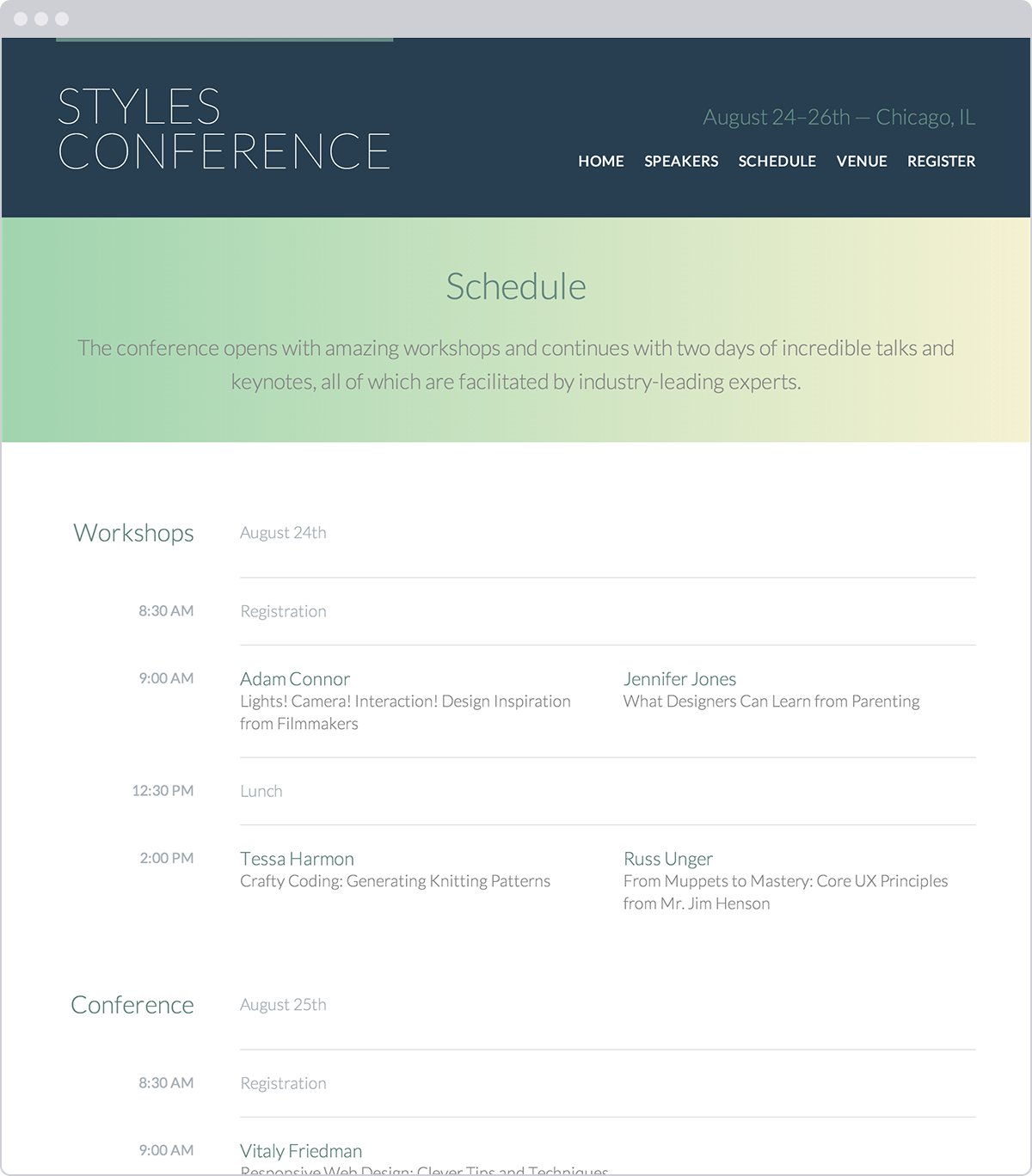
The Schedule page, which includes multiple tables, for Styles Conference
Demo & Source Code
Below you may view the Styles Conference website in its current state, as well as download the source code for the website in its current state.
View the Styles Conference Website or Download the Source Code (Zip file)
Summary
All right, we now know how to semantically lay out tabular data within HTML while also making it intuitive with CSS. Discussing tables was our last major hurdle in learning HTML and CSS, and we have now officially finished our Styles Conference website.
To review, within this lesson we covered the following:
- The best ways to semantically create tables
- How to make individual table cells span multiple columns or rows
- The structural elements that make up tables
- Different ways to style borders on a table, and how different border properties affect a table’s appearance
- How to vertically align text within a table
We’ve done a great job at putting all of our new skills to use, and we’re miles beyond where we were a few lessons ago. Let’s end on a high note, tie up some loose ends, and look at ways to write our best possible code.
Resources & Links
- Bring on the tables via 456 Berra St.