Lesson 8
Creating Lists
Lists are a part of everyday life. To-do lists determine what to get done. Navigational routes provide turn-by-turn lists of directions. Recipes provide lists of ingredients and lists of instructions. With a list for nearly everything, it’s easy to understand why they are also popular online.
When we want to use a list on a website, HTML provides three different types to choose from: unordered, ordered, and description lists. Choosing which type of list to use—or whether to use a list at all—comes down to the content and the most semantically appropriate option for displaying that content.
In addition to the three different types of lists available within HTML, there are multiple ways to style these lists with CSS. For example, we can choose what type of marker to use on a list. The marker could be square, round, numeric, alphabetical, or perhaps nonexistent. Also, we can decide if a list should be displayed vertically or horizontally. All of these choices play significant roles in the styling of our web pages.
Unordered Lists
An unordered list is simply a list of related items whose order does not matter. Creating an unordered list in HTML is accomplished using the unordered list block-level element, <ul>. Each item within an unordered list is individually marked up using the list item element, <li>.
By default, most browsers add a vertical margin and left padding to the <ul> element and precede each <li> element with a solid dot. This solid dot is called the list item marker, and it can be changed using CSS.
1
2
3
4
5
6
<ul>
<li>Orange</li>
<li>Green</li>
<li>Blue</li>
</ul>
Unordered Lists Demo
See the Pen Unordered Lists by Shay Howe (@shayhowe) on CodePen.
Ordered Lists
The ordered list element, <ol>, works very much like the unordered list element; individual list items are created in the same manner. The main difference between an ordered list and an unordered list is that with an ordered list, the order in which items are presented is important.
Because the order matters, instead of using a dot as the default list item marker, an ordered list uses numbers.
1
2
3
4
5
6
<ol>
<li>Head north on N Halsted St</li>
<li>Turn right on W Diversey Pkwy</li>
<li>Turn left on N Orchard St</li>
</ol>
Ordered lists also have unique attributes available to them including start and reversed.
Ordered Lists Demo
See the Pen Ordered Lists by Shay Howe (@shayhowe) on CodePen.
Start Attribute
The start attribute defines the number from which an ordered list should start. By default, ordered lists start at 1. However, there may be cases where a list should start at 30 or another number. When we use the start attribute on the <ol> element, we can identify exactly which number an ordered list should begin counting from.
The start attribute accepts only integer values, even though ordered lists may use different numbering systems, such as roman numerals.
1
2
3
4
5
6
<ol start="30">
<li>Head north on N Halsted St</li>
<li>Turn right on W Diversey Pkwy</li>
<li>Turn left on N Orchard St</li>
</ol>
Start Attribute Demo
See the Pen Start Attribute by Shay Howe (@shayhowe) on CodePen.
Reversed Attribute
The reversed attribute, when used on the <ol> element, allows a list to appear in reverse order. An ordered list of five items numbered 1 to 5 may be reversed and ordered from 5 to 1.
The reversed attribute is a Boolean attribute, and as such it doesn’t accept any value. It is either true or false. False is the default value; the value becomes true when the attribute name reversed appears on the <ol> element.
1
2
3
4
5
6
<ol reversed>
<li>Head north on N Halsted St</li>
<li>Turn right on W Diversey Pkwy</li>
<li>Turn left on N Orchard St</li>
</ol>
Reversed Attribute Demo
See the Pen Reversed Attribute by Shay Howe (@shayhowe) on CodePen.
Value Attribute
The value attribute may be used on an individual <li> element within an ordered list to change its value within the list. The number of any list item appearing below a list item with a value attribute will be recalculated accordingly.
As an example, if the second list item has a value attribute value of 9, the number on that list item marker will appear as if it is the ninth item. All subsequent list items will be numbered upwards from 9.
1
2
3
4
5
6
<ol>
<li>Head north on N Halsted St</li>
<li value="9">Turn right on W Diversey Pkwy</li>
<li>Turn left on N Orchard St</li>
</ol>
Value Attribute Demo
See the Pen Value Attribute by Shay Howe (@shayhowe) on CodePen.
Description Lists
Another type of list seen online (but not as often as unordered or ordered lists) is the description list. Description lists are used to outline multiple terms and their descriptions, as in a glossary, for example.
Creating a description list in HTML is accomplished using the description list block-level element, <dl>. Instead of using a <li> element to mark up list items, the description list requires two block-level elements: the description term element, <dt>, and the description element, <dd>.
A description list may contain numerous terms and descriptions, one after the other. Additionally, a description list may have multiple terms per description, as well as multiple descriptions per term. A single term may have multiple meanings and warrant multiple descriptions. Conversely, a single description may be suitable for multiple terms.
When adding a description list, the <dt> element must come before the <dd> element. The definition term and the description that directly follows it correspond to one another; thus, the order of these elements is important.
By default, the <dl> element will include vertical margins, just like the <ul> and <ol> elements. Additionally, the <dd> element includes a left margin by default.
1
2
3
4
5
6
7
8
9
10
11
<dl>
<dt>study</dt>
<dd>The devotion of time and attention to acquiring knowledge on an academic subject, especially by means of books</dd>
<dt>design</dt>
<dd>A plan or drawing produced to show the look and function or workings of a building, garment, or other object before it is built or made</dd>
<dd>Purpose, planning, or intention that exists or is thought to exist behind an action, fact, or material object</dd>
<dt>business</dt>
<dt>work</dt>
<dd>A person's regular occupation, profession, or trade</dd>
</dl>
Description Lists Demo
See the Pen Description Lists by Shay Howe (@shayhowe) on CodePen.
Nesting Lists
One feature that makes lists extremely powerful is their ability to be nested. Every list may be placed within another list; they can be nested continually. But the potential to nest lists indefinitely doesn’t provide free rein to do so. Lists should still be reserved specifically for where they hold the most semantic value.
One trick with nesting lists is to know where to begin and end each list and list item. Speaking specifically about unordered and ordered lists, as that is where most nesting will occur, the only element that may reside directly within the <ul> and <ol> elements is the <li> element. To repeat, the only element we can place as a direct child of the <ul> and <ol> elements is the <li> element.
That said, once inside the <li> element, the standard set of elements may be added, including any <ul> or <ol> elements.
To nest a list rather than closing a list item, begin a new list. Once the nested list is complete and closed, close the wrapping list item and continue on with the original list.
1
2
3
4
5
6
7
8
9
10
11
12
13
14
15
<ol>
<li>Walk the dog</li>
<li>Fold laundry</li>
<li>
Go to the grocery and buy:
<ul>
<li>Milk</li>
<li>Bread</li>
<li>Cheese</li>
</ul>
</li>
<li>Mow the lawn</li>
<li>Make dinner</li>
</ol>
Nesting Lists Demo
See the Pen Nesting Lists by Shay Howe (@shayhowe) on CodePen.
Because nesting lists can be a little tricky—and unwanted styles will appear if it’s done incorrectly—let’s quickly review. The <ul> and <ol> elements may contain only <li> elements. The <li> element may contain any normal element as desired; however, the <li> element has to be a direct child of either a <ul> or <ol> element.
It’s also worth noting that as lists are nested inside of other lists, their list item markers will change according to how deeply the list is nested. In the previous example, the unordered list nested within the ordered list uses hollow circles instead of solid discs as the list item marker. This change happens because the unordered list is nested one level into the ordered list.
Fortunately we have control over how these list item markers appear at any level, which we’ll take a look at next.
List Item Styling
Unordered and ordered lists use list item markers by default. For unordered lists these are typically solid dots, while ordered lists typically use numbers. With CSS the style and position of these list item markers may be adjusted.
List Style Type Property
The list-style-type property is used to set the content of a list item marker. The available values range from squares and decimal numbers all the way to Armenian numbering, and the style may be placed on either the <ul>, <ol>, or <li> elements within CSS.
Any list-style-type property value can be added to either unordered or ordered lists. With this in mind, it is possible to use a numeric list item marker on an unordered list and a nonnumeric marker on an ordered list.
HTML
1
2
3
4
5
6
<ul>
<li>Orange</li>
<li>Green</li>
<li>Blue</li>
</ul>
CSS
1
2
3
4
ul {
list-style-type: square;
}
List Style Type Property Demo
See the Pen List Style Type Property by Shay Howe (@shayhowe) on CodePen.
List Style Type Values
As previously mentioned, the list-style-type property comes with a handful of different values. The following list outlines these values as well as their corresponding content.
| List Style Type Value | Content |
|---|---|
none |
No list item |
disc |
A filled circle |
circle |
A hollow circle |
square |
A filled square |
decimal |
Decimal numbers |
decimal-leading-zero |
Decimal numbers padded by initial zeros |
lower-roman |
Lowercase roman numerals |
upper-roman |
Uppercase roman numerals |
lower-greek |
Lowercase classical Greek |
lower-alpha / lower-latin |
Lowercase ASCII letters |
upper-alpha / upper-latin |
Uppercase ASCII letters |
armenian |
Traditional Armenian numbering |
georgian |
Traditional Georgian numbering |
Using an Image as a List Item Marker
There may come a time when the default list-style-type property values are not enough, and we want to customize our own list item marker. Doing so is most commonly accomplished by placing a background image on each <li> element within a list.
The process includes removing any default list-style-type property value and adding a background image and padding to the <li> element.
In detail, the list-style-type property value of none will remove existing list item markers. The background property will identify a background image, along with its position and repeat value, if necessary. And the padding property will provide space to the left of the text for the background image.
HTML
1
2
3
4
5
6
<ul>
<li>Orange</li>
<li>Green</li>
<li>Blue</li>
</ul>
CSS
1
2
3
4
5
6
li {
background: url("arrow.png") 0 50% no-repeat;
list-style-type: none;
padding-left: 12px;
}
Image List Item Marker Demo
See the Pen Image List Item Marker by Shay Howe (@shayhowe) on CodePen.
List Style Position Property
By default the list item marker is to the left of the content within the <li> element. This list style positioning is described as outside, meaning all of the content will appear directly to the right, outside of the list item marker. Using the list-style-position property, we can change the default value of outside to inside or inherit.
The outside property value places the list item marker to the left of the <li> element and doesn’t allow any content to wrap below the list item marker. The inside property value (which is rarely seen or used) places the list item marker in line with the first line of the <li> element and allows other content to wrap below it as needed.
HTML
1
2
3
4
5
<ul>
<li>Cupcakes...</li>
<li>Sprinkles...</li>
</ul>
CSS
1
2
3
4
ul {
list-style-position: inside;
}
List Style Position Property Demo
See the Pen List Style Position Property by Shay Howe (@shayhowe) on CodePen.
Shorthand List Style Property
The list style properties discussed thus far, list-style-type and list-style-position, can be combined into one shorthand list-style property value. When using the list-style property, we can use one or all list style property values at a time. The order of these shorthand values should be list-style-type followed by list-style-position.
1
2
3
4
5
6
7
ul {
list-style: circle inside;
}
ol {
list-style: lower-roman;
}
Horizontally Displaying List
Occasionally we may want to display lists horizontally rather than vertically. Perhaps we want to divide a list into multiple columns, to build a navigational list, or to put a few list items in a single row. Depending on the content and desired appearance, there are a few different ways to display lists as a single line, such as by making the display property value of <li> elements inline or inline-block or by floating them.
Displaying List
The quickest way to display a list on a single line is to give the <li> elements a display property value of inline or inline-block. Doing so places all the <li> elements within a single line, with a single space between each list item.
If the spaces between each of the <li> elements are troublesome, they may be removed using the same techniques we discussed in Lesson 5, “Positioning Content.”
More often than not, we’ll use the inline-block property value rather than the inline property value. The inline-block property value allows us to easily add vertical margins and other spacing to the <li> elements, whereas the inline property value does not.
When changing the display property value to inline or inline-block, the list item marker, be it a bullet, number, or other style, is removed.
HTML
1
2
3
4
5
6
<ul>
<li>Orange</li>
<li>Green</li>
<li>Blue</li>
</ul>
CSS
1
2
3
4
5
li {
display: inline-block;
margin: 0 10px;
}
Inline-Block Displaying List Demo
See the Pen Inline-Block Displaying List by Shay Howe (@shayhowe) on CodePen.
Floating List
Changing the display property value to inline or inline-block is quick; however, it removes the list item marker. If the list item marker is needed, floating each <li> element is a better option than changing the display property.
Setting all <li> elements’ float property to left will horizontally align all <li> elements directly next to each other without any space between them. When we float each <li> element, the list item marker is displayed by default and will actually sit on top of the <li> element next to it. To prevent the list item marker from being displayed on top of other <li> elements, a horizontal margin or padding should be added.
HTML
1
2
3
4
5
6
<ul>
<li>Orange</li>
<li>Green</li>
<li>Blue</li>
</ul>
CSS
1
2
3
4
5
li {
float: left;
margin: 0 20px;
}
Floating List Demo
See the Pen Floating List by Shay Howe (@shayhowe) on CodePen.
As when floating any element, this breaks the flow of the page. We must remember to clear our floats—most commonly with the clearfix technique—and return the page back to its normal flow.
Navigational List Example
We’ll often develop, and find, navigation menus using unordered lists. These lists are commonly laid out as horizontal lists, using either of the two techniques previously mentioned. Here is an example of a horizontal navigation menu marked up using an unordered list with <li> elements displayed as inline-block elements.
HTML
1
2
3
4
5
6
7
8
9
<nav class="navigation">
<ul>
<li><a href="#">Profile</a></li><!--
--><li><a href="#">Settings</a></li><!--
--><li><a href="#">Notifications</a></li><!--
--><li><a href="#">Logout</a></li>
</ul>
</nav>
CSS
1
2
3
4
5
6
7
8
9
10
11
12
13
14
15
16
17
18
19
20
21
22
23
24
25
26
27
28
29
.navigation ul {
font: bold 11px "Helvetica Neue", Helvetica, Arial, sans-serif;
margin: 0;
padding: 0;
text-transform: uppercase;
}
.navigation li {
display: inline-block;
}
.navigation a {
background: #395870;
background: linear-gradient(#49708f, #293f50);
border-right: 1px solid rgba(0, 0, 0, .3);
color: #fff;
padding: 12px 20px;
text-decoration: none;
}
.navigation a:hover {
background: #314b60;
box-shadow: inset 0 0 10px 1px rgba(0, 0, 0, .3);
}
.navigation li:first-child a {
border-radius: 4px 0 0 4px;
}
.navigation li:last-child a {
border-right: 0;
border-radius: 0 4px 4px 0;
}
Navigational List Demo
See the Pen Navigational List by Shay Howe (@shayhowe) on CodePen.
In Practice
Now that we know how to build lists within HTML and CSS, let’s loop back to our Styles Conference website and see where we might be able to use lists.
-
Currently the navigation menus within the
<header>and<footer>elements on our pages consist of a handful of anchor elements. These anchor elements could be better organized in an unordered list.Using an unordered list (via the
<ul>element) and list items (via the<li>element) will give structure to our navigation menus. These new elements, however, will display our navigation menus vertically.We’re going to want to change the
displayvalue of our<li>elements to inline-block to get all of them to align in a horizontal row. When we do that, though, we’ll also need to account for the blank space left between each<li>element. Thinking back to Lesson 5, “Positioning Content,” we know that opening an HTML comment at the end of a<li>element and closing an HTML comment at the beginning of a<li>element will remove this space.Keeping this in mind, the markup for the navigation menu within our
<header>element will now look like this:1 2 3 4 5 6 7 8 9 10
<nav class="nav primary-nav"> <ul> <li><a href="index.html">Home</a></li><!-- --><li><a href="speakers.html">Speakers</a></li><!-- --><li><a href="schedule.html">Schedule</a></li><!-- --><li><a href="venue.html">Venue</a></li><!-- --><li><a href="register.html">Register</a></li> </ul> </nav>
Along these same lines, the markup for the navigation menu within our
<footer>element will now look like this:1 2 3 4 5 6 7 8 9 10
<nav class="nav"> <ul> <li><a href="index.html">Home</a></li><!-- --><li><a href="speakers.html">Speakers</a></li><!-- --><li><a href="schedule.html">Schedule</a></li><!-- --><li><a href="venue.html">Venue</a></li><!-- --><li><a href="register.html">Register</a></li> </ul> </nav>
Let’s not forget to make these changes in all of our HTML files.
-
With the unordered list in place, let’s make sure the list items align horizontally, and let’s clean up their styles a bit. We’ll use the existing
navclass to help target our new styles.We’ll begin by setting all of the
<li>elements within any element with theclassattribute value ofnavto be displayedinline-block, to include some horizontal margins, and to be vertically aligned to thetopof the element.Additionally, we’ll use the
:last-childpseudo-class selector to identify the last<li>element and reset its rightmarginto0. Doing so ensures that any horizontal space between the<li>element and the edge of its parent element is removed.Within our
main.cssfile, below our existing navigation styles, let’s add the following CSS:1 2 3 4 5 6 7 8 9
.nav li { display: inline-block; margin: 0 10px; vertical-align: top; } .nav li:last-child { margin-right: 0; }
You may be wondering why our unordered list didn’t include any list item markers or default styles. These styles were removed by the reset at the top of our style sheet. If we look at the reset, we’ll see our
<ol>,<ul>, and<li>elements all include amarginandpaddingof0, and our<ol>and<ul>elements have alist-stylevalue ofnone. -
Our navigation menus aren’t the only places we’ll be using lists. We’ll also use them on some of our internal pages, including the Speakers page. Let’s add some speakers to our conference.
Within our
speakers.htmlfile just below our lead section, let’s create a new section where we’ll present all of our speakers. Reusing some existing styles, we’ll use a<section>element with a class attribute value ofrowto wrap all of our speakers and apply a white background and padding behind them. Inside the<section>element, we’ll add a<div>element with aclassattribute value ofgridto center our speakers on the page and allow us to use multiple columns in doing so.So far our HTML below the lead section looks like this:
1 2 3 4 5 6
<section class="row"> <div class="grid"> </div> </section>
-
Inside the grid every speaker will be marked up with his or her own
<section>element, which will include two columns. The first column will span two-thirds of the<section>element and will be marked up using a<div>element. The second column will span the remaining one-third of the<section>element and will be marked up using an<aside>element, as its content is secondary to the speaker and his or her specific talk.Using our existing
col-2-3andcol-1-3classes, the outline for a speaker section will look like this:1 2 3 4 5 6 7 8 9 10 11 12
<section id="shay-howe"> <div class="col-2-3"> ... </div><!-- --><aside class="col-1-3"> ... </aside> </section>
There are a few items to notice here. First, each
<section>element for each speaker includes an ID attribute with the speaker’s name as the attribute value. Later, when we create the schedule for our conference, these ID attributes will serve as anchors, allowing us to link from the schedule to a speaker’s profile.Additionally, the closing tag of the
<div>element is followed by the opening of an HTML comment, and the opening tag of the<aside>element is preceded by the closing of an HTML comment. Because the column-based classes will display these elements asinline-blockelements, we are removing the blank space that will appear between them. -
Inside the two-thirds column, marked up with the
<div>element, we’ll use a few headings and paragraphs to show the speaker’s name, the title and abstract of the talk, and a short biography.Including this content, a speaker section will look like this:
1 2 3 4 5 6 7 8 9 10 11 12 13 14 15 16 17 18 19
<section id="shay-howe"> <div class="col-2-3"> <h2>Shay Howe</h2> <h5>Less Is More: How Constraints Cultivate Growth</h5> <p>By setting constraints, we force ourselves...</p> <h5>About Shay</h5> <p>As a designer and front-end developer, Shay...</p> </div><!-- --><aside class="col-1-3"> ... </aside> </section>
-
Within the one-third column, marked up with an
<aside>element, we’re going to add a<div>element with a class attribute value ofspeaker-info. We’ll use a<div>element because we’ll be adding styles to this element soon.Before getting into any styles, though, let’s add an unordered list within the
<div>element that includes as list items some relevant links for the speaker.Now our HTML for a speaker will look like this:
1 2 3 4 5 6 7 8 9 10 11 12 13 14 15 16 17 18 19 20 21 22 23 24 25 26
<section id="shay-howe"> <div class="col-2-3"> <h2>Shay Howe</h2> <h5>Less Is More: How Constraints Cultivate Growth</h5> <p>By setting constraints, we force ourselves...</p> <h5>About Shay</h5> <p>As a designer and front-end developer, Shay...</p> </div><!-- --><aside class="col-1-3"> <div class="speaker-info"> <ul> <li><a href="https://twitter.com/shayhowe">@shayhowe</a></li> <li><a href="http://learn.shayhowe.com/">learn.shayhowe.com</a></li> </ul> </div> </aside> </section>
-
With the
<div>element with a class attribute value ofspeaker-infoready, we can add some styles to it.We’ll begin by adding a new section within our
main.cssfile for the Speaker page styles. From there, let’s add a1-pixel solid grayborderwith a5-pixel radius around any element that includes the class attribute value ofspeaker-info.Next, let’s add a top
marginof88pixels to position the element on the same vertical line as the first paragraph of the talk description, and let’s also add22pixels of verticalpaddinginside the element to provide room for the nested unordered list.Lastly, let’s center all of the text within the element.
In all, our CSS for the speaker-info class rule set looks like this:
1 2 3 4 5 6 7 8 9 10 11 12 13 14
/* ======================================== Speakers ======================================== */ .speaker-info { border: 1px solid #dfe2e5; border-radius: 5px; margin-top: 88px; padding: 22px 0; text-align: center; }
Let’s take a minute to review why we’re using a
<div>element here and the corresponding styles.We’re placing a
<div>element inside the<aside>element with the class attribute value ofcol-1-3because we’ll want thepaddinginherited from thecol-1-3class to be outside of theborderon the<div>element. Before long we’ll be including an image within the<div>element, alongside the unordered list; therefore we created a<div>element as opposed to applying these styles directly to the<ul>element. -
As we add more and more speakers to the page, we’ll want to ensure that they remain an equal distance apart vertically. To do so, we’ll create a
speakerclass rule set which includes a bottommarginof44pixels, like this:1 2 3 4
.speaker { margin-bottom: 44px; }
We can then apply this class to the
<section>element for each speaker, provided it isn’t the last speaker. We’ll omit this class on the last speaker, as we don’t want to create any unnecessary margins before our<footer>element. With more than one speaker, our layout will look like this:1 2 3 4 5 6 7 8 9 10 11 12 13 14 15 16 17 18 19 20 21 22 23 24 25 26 27 28 29 30
<section class="row"> <div class="grid"> <section class="speaker" id="chris-mills"> <div class="col-2-3"> ... </div><!-- --><aside class="col-1-3"> ... </aside> </section> <section id="shay-howe"> <div class="col-2-3"> ... </div><!-- --><aside class="col-1-3"> ... </aside> </section> </div> </section>
Notice how the first speaker
<section>element, for Chris Mills, includes theclassattribute value ofspeaker, which vertically separates it from the speaker<section>element for myself, Shay Howe. The last speaker<section>element, again for myself, doesn’t include aclassattribute value ofspeakerin order to keep it a proper distance from the<footer>element.
Our navigation menus are now complete, and the Speakers page is taking shape.
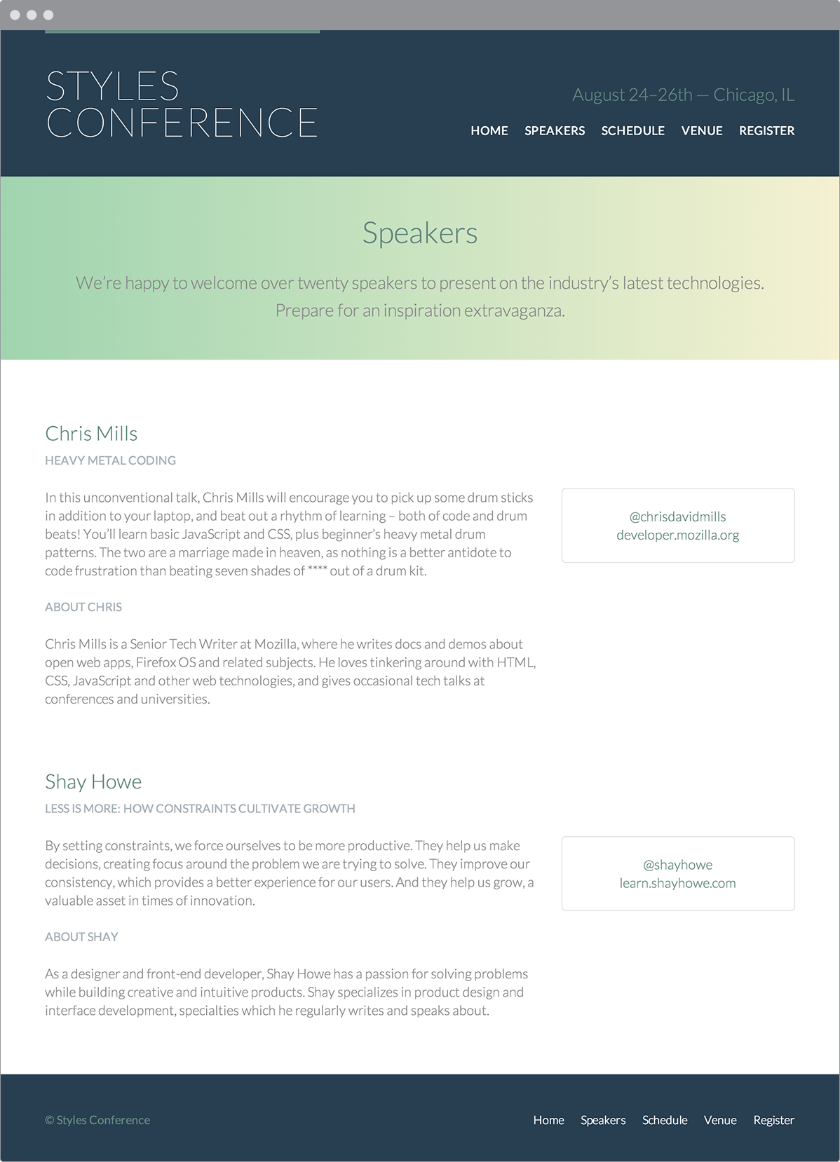
Our Speakers page after updating our navigation menus and adding speakers
Demo & Source Code
Below you may view the Styles Conference website in its current state, as well as download the source code for the website in its current state.
View the Styles Conference Website or Download the Source Code (Zip file)
Summary
Lists are used quite commonly in HTML, often in places that might not be obvious or apparent. The key is to use them as semantically as possible and to leverage them where they best fit.
Let’s recap. Within this lesson we covered the following:
- How to create unordered, ordered, and description lists
- How to properly nest lists inside of other lists
- How to change the list item marker style and position
- How to use a background image instead of a list item marker
- How to horizontally display or float lists
Now that we know how to add lists to our pages, let’s add media to our pages, too. In the next chapter we’ll dive into embeddable media such as images, audio, and video.
Resources & Links
- Styling HTML Lists with CSS via Smashing Magazine
- List Style Type via Mozilla Developer Network
- CSS Design: Taming Lists via A List Apart